Introduction
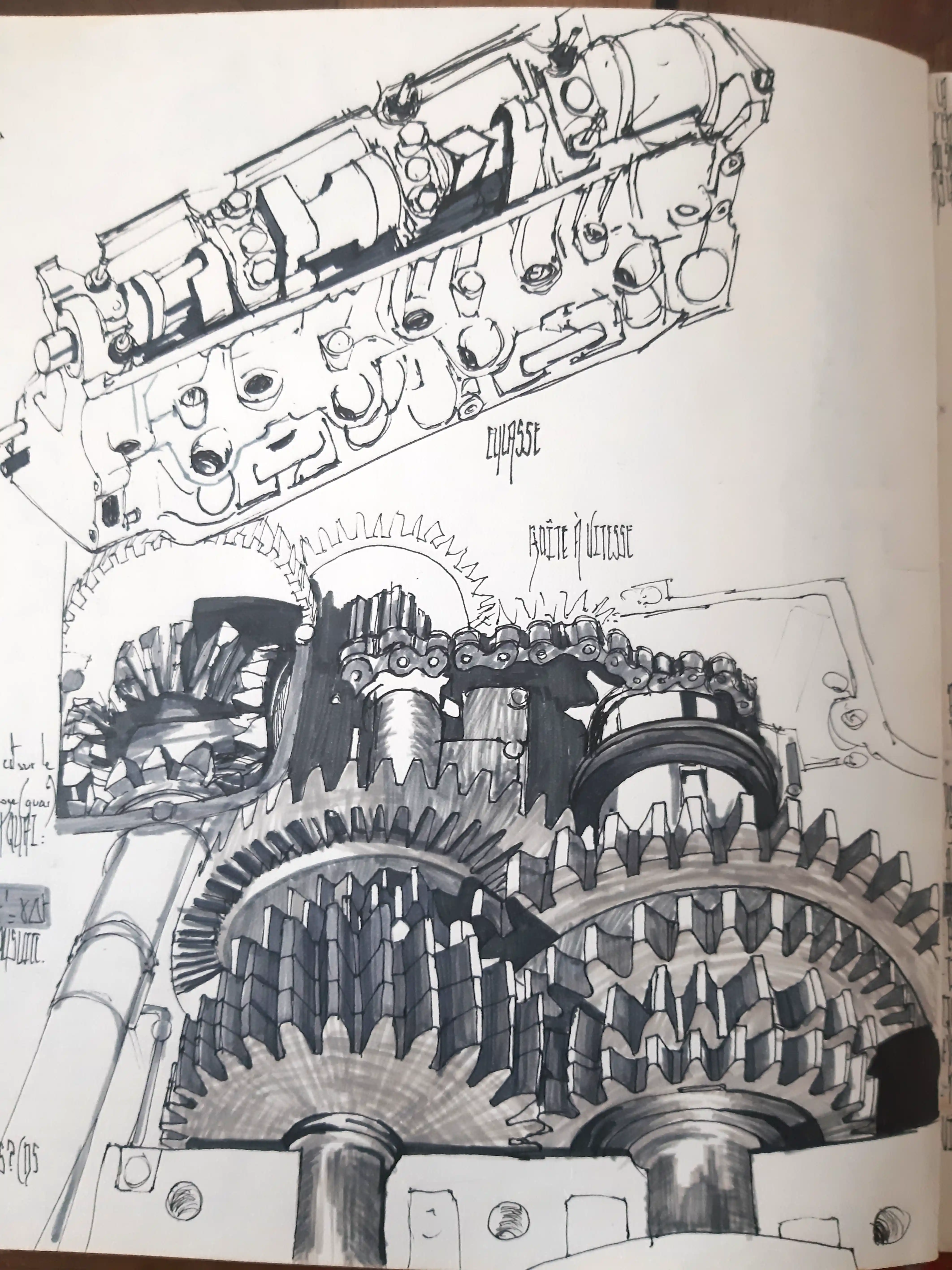
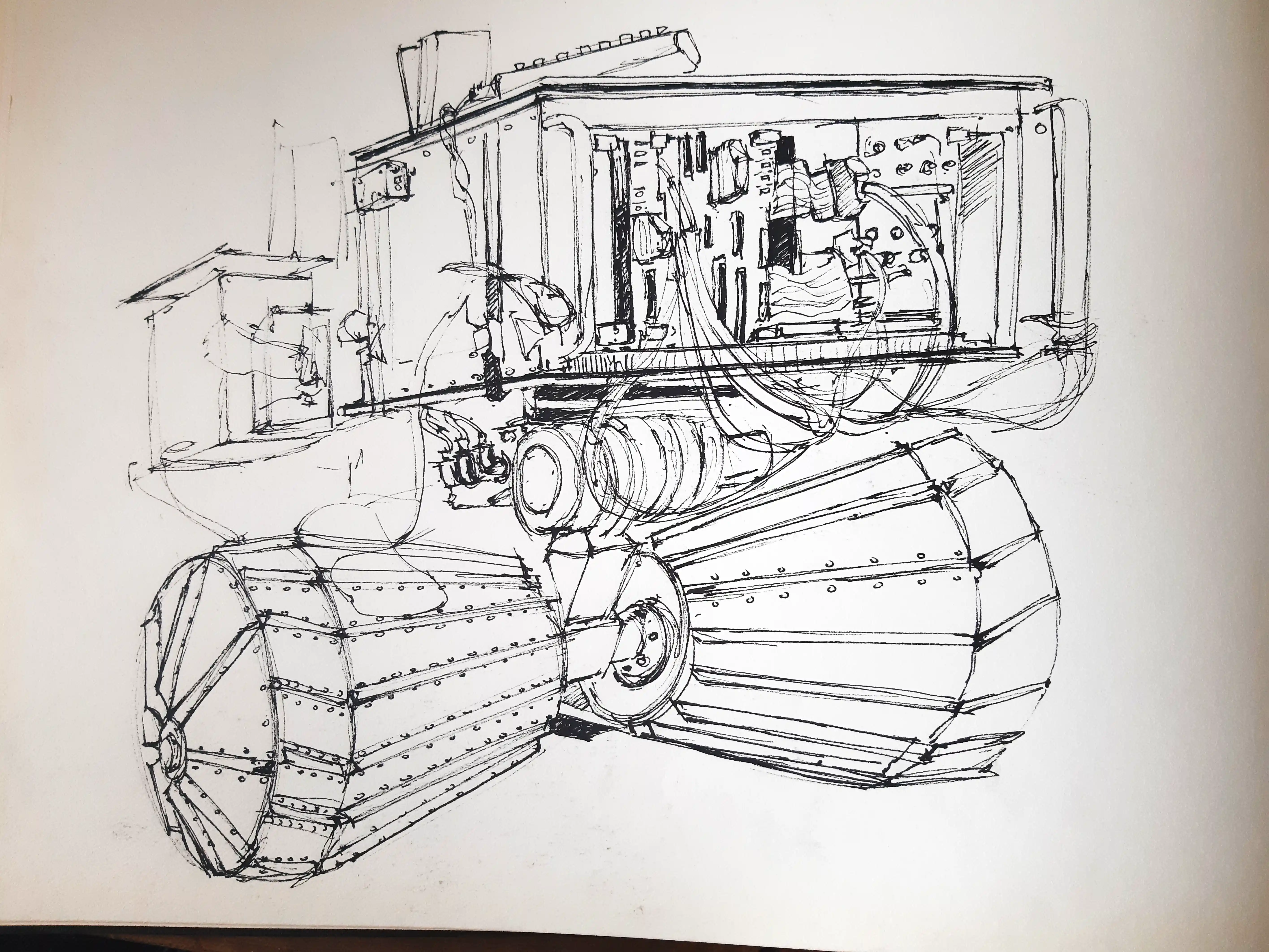
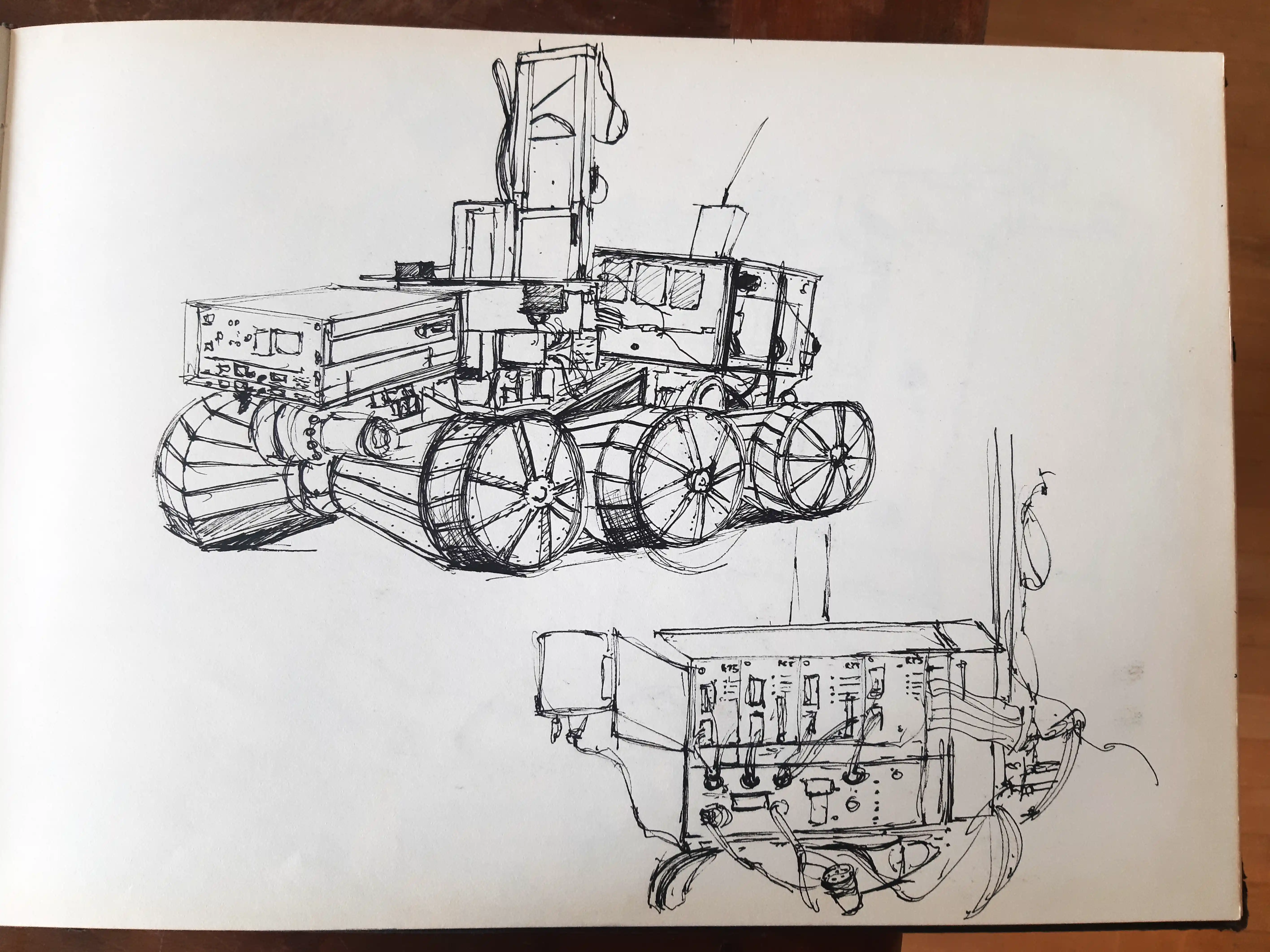
Building a visual identity started with a long phase of exploration combining sketches, graphic research and experimentation.
This process helped me define the foundations of my visual language through composition, storytelling and color.
First landmarks
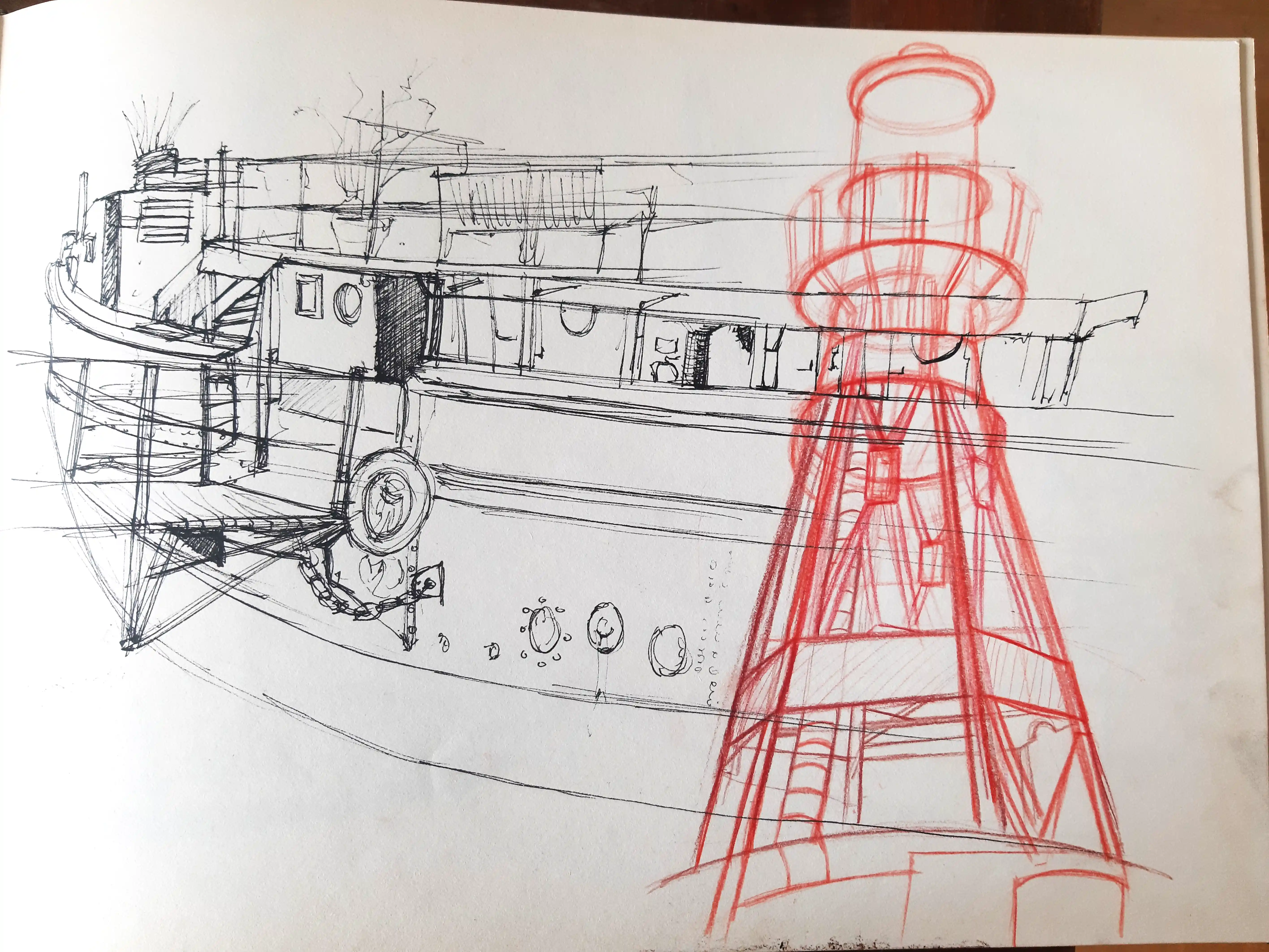
The first experiments helped identify the influences that would gradually shape my graphic universe.
Studying styles, techniques and narrative approaches became an essential step in this evolution.
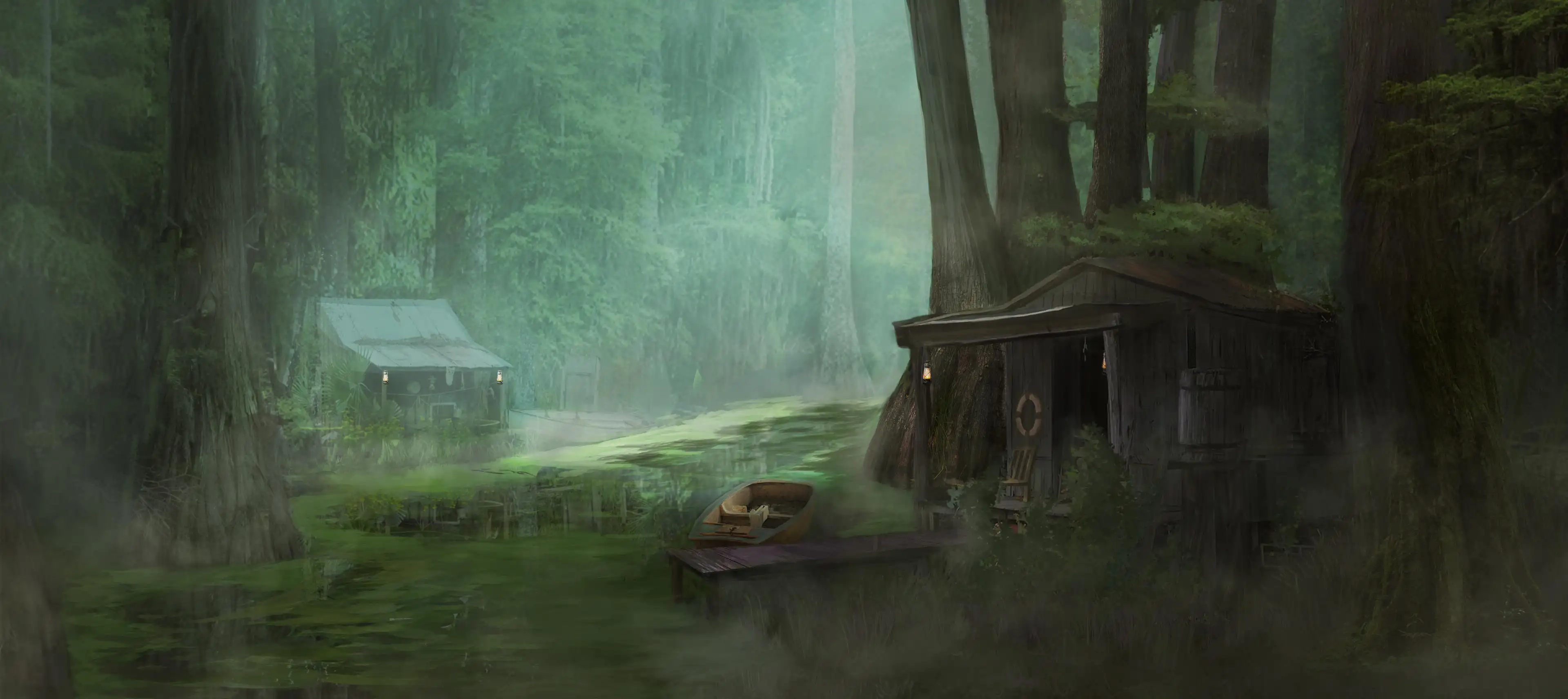
Turning point
This stage marks a change in my approach to images, focusing on the balance between detail, atmosphere and storytelling.
From this point onwards, the illustrations began to develop a more personal and distinctive identity.
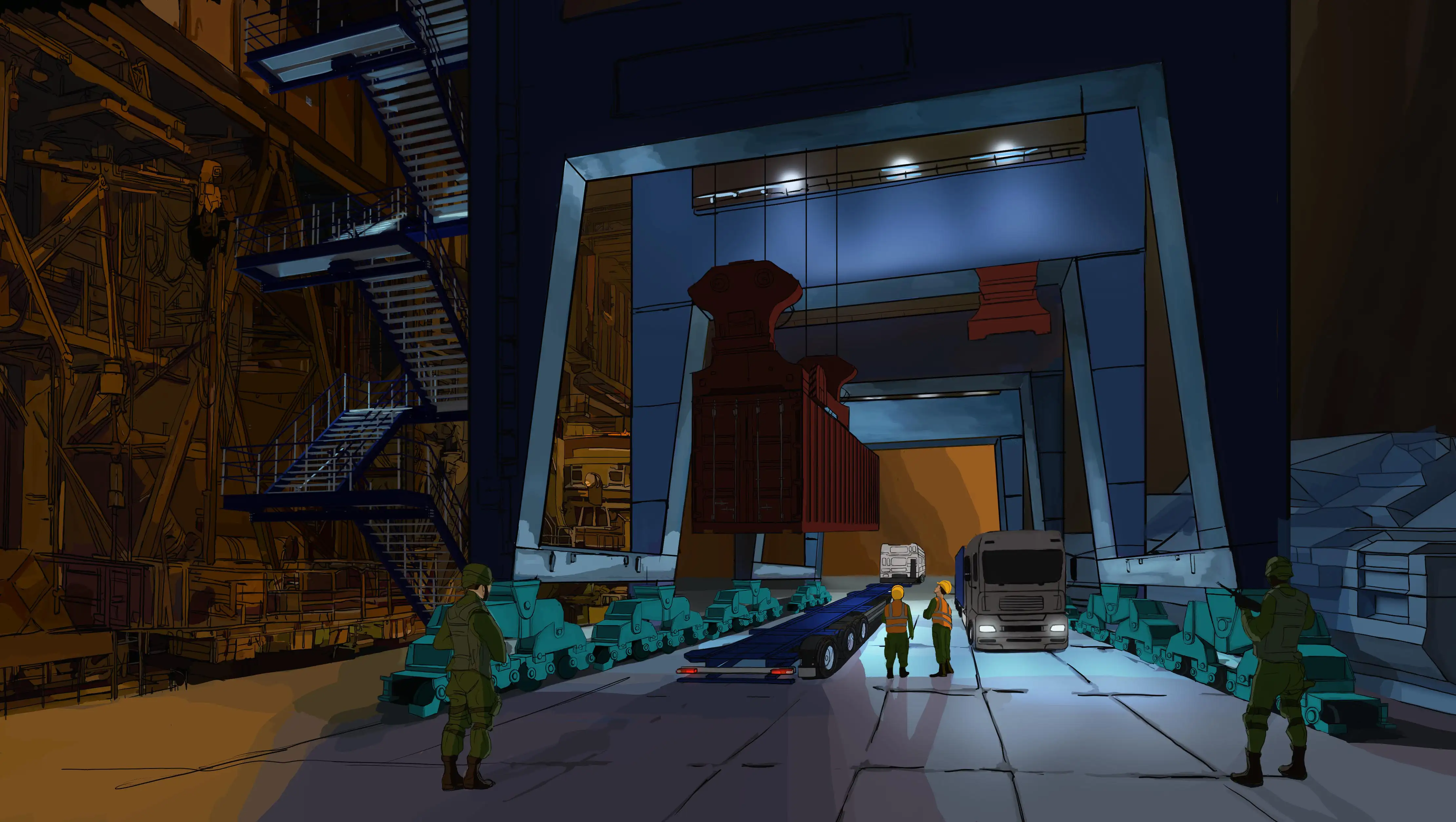
From Sketch to Color
This first stage builds on a traditional drawing approach, gradually enriched through the use of color.
Light becomes a narrative element, highlighting key areas while maintaining a graphic style.
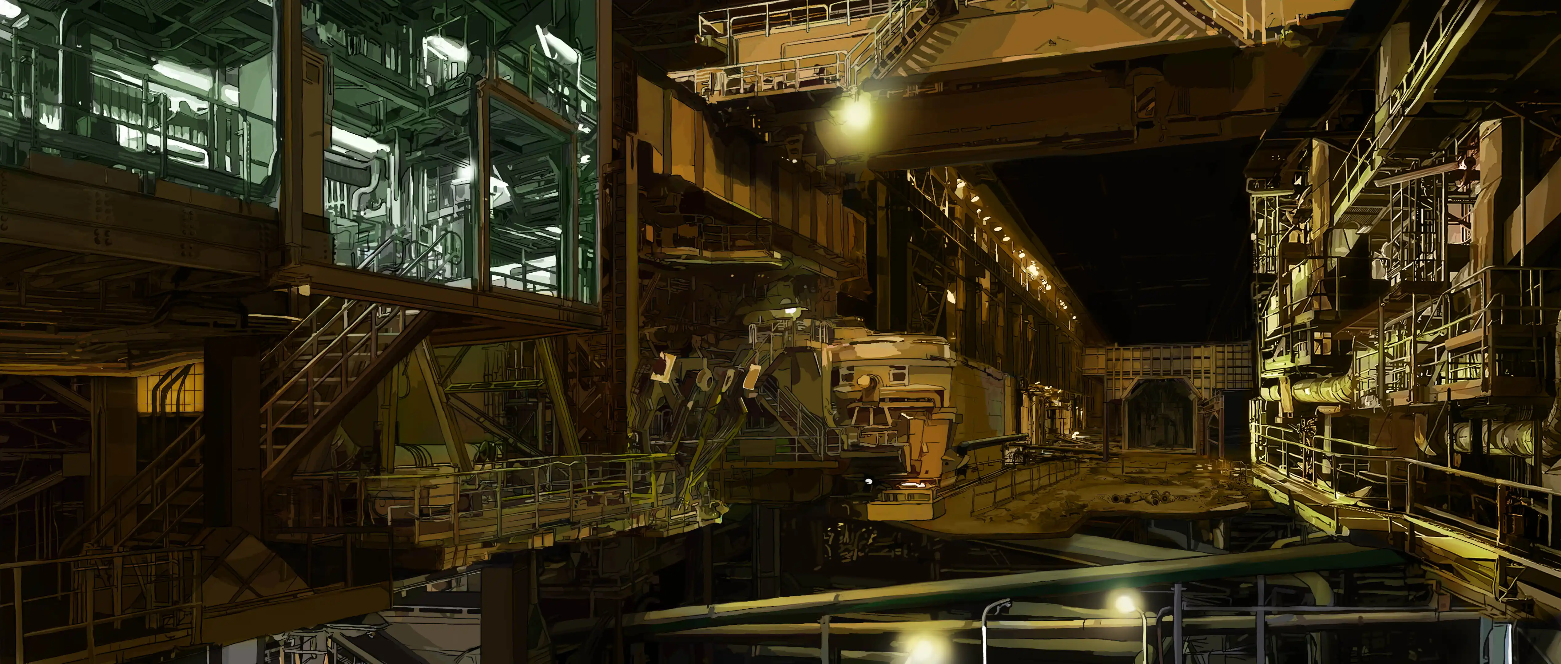
Moving Away from the Black Outline
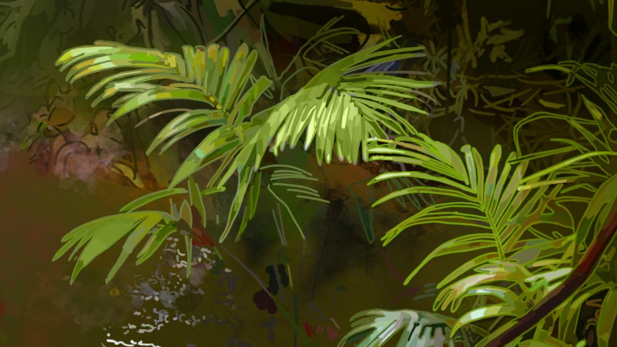
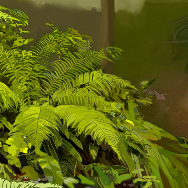
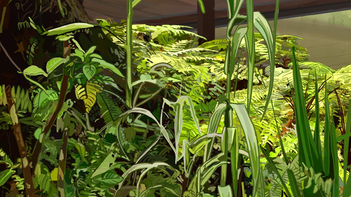
This stage marks a gradual move away from black outlines, considered too dominant visually.
Colored lines become a way to harmonize elements with their surroundings.
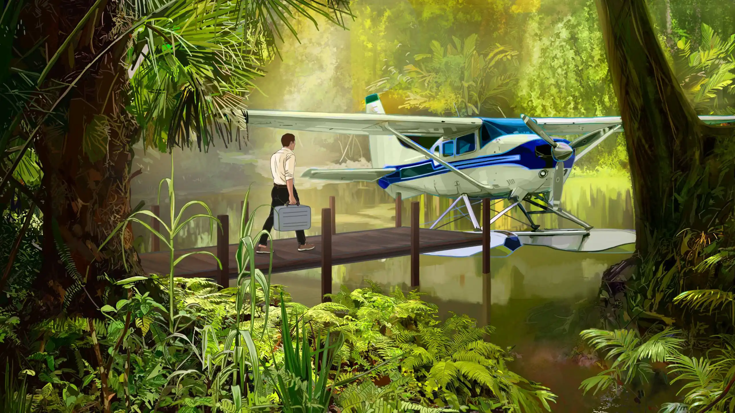
A More Subtle Outline
As vegetation became a central element of the image, I wanted to develop a more detailed treatment without letting the outline overpower the forms. I gradually made it more subtle: visible in some areas, sometimes lightened or slightly darkened depending on the volumes, so that it could naturally blend into the overall image.
The colored outline gradually evolved into a more discreet element. Used selectively, it supports certain forms and helps guide the viewer’s eye without imposing itself on the composition.
Harmonizing the Line
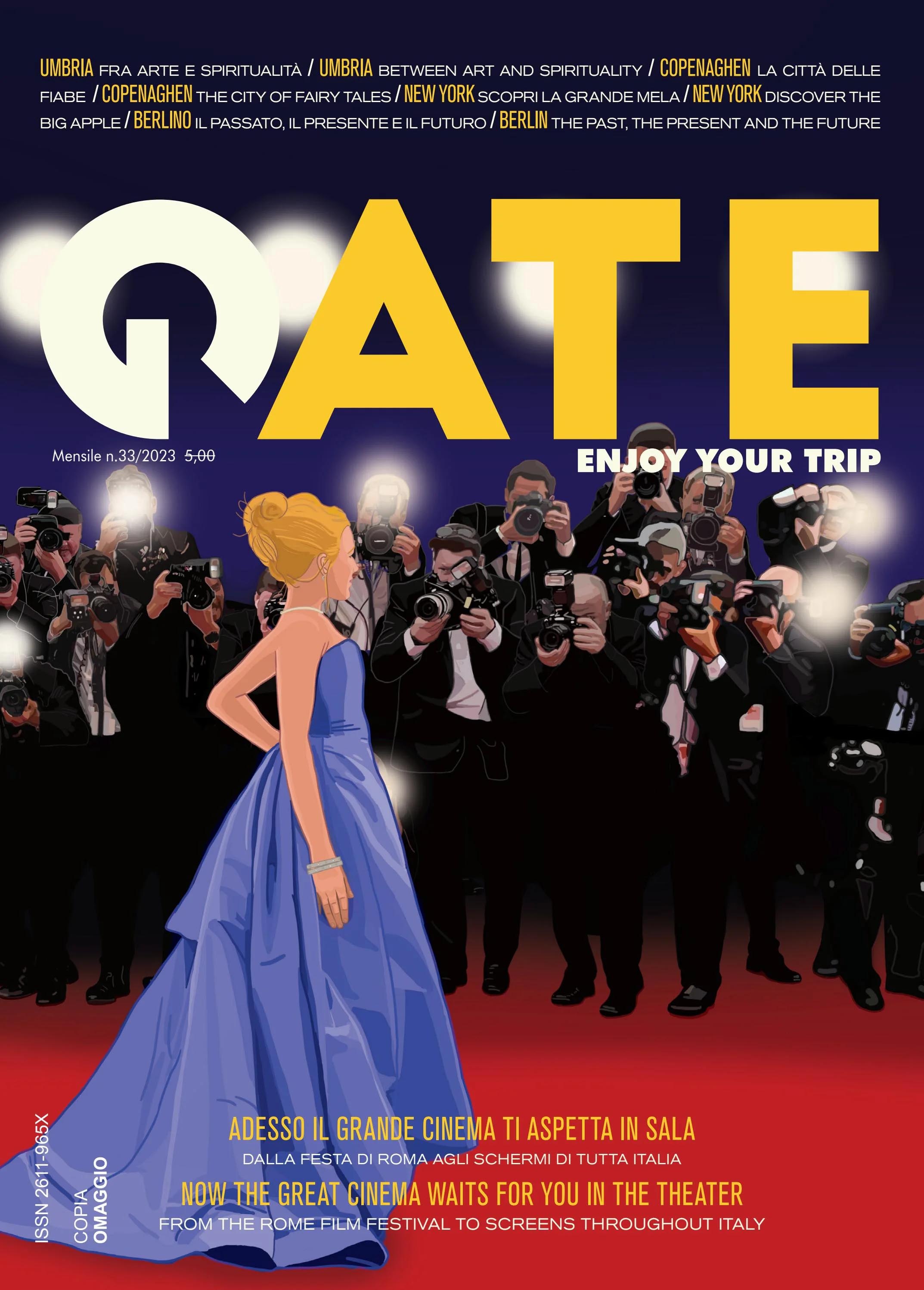
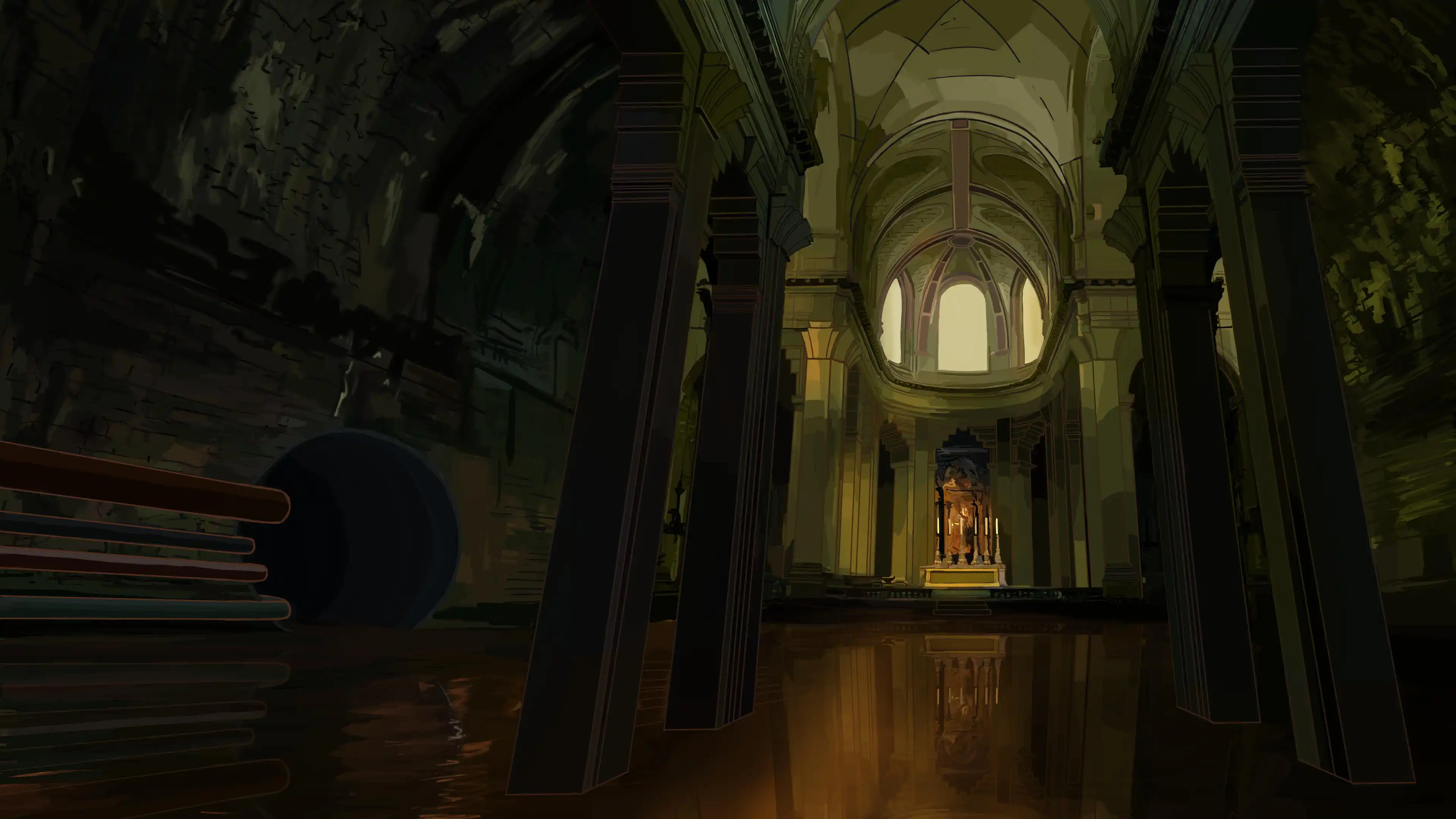
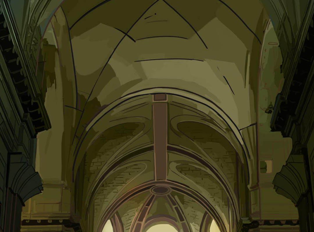
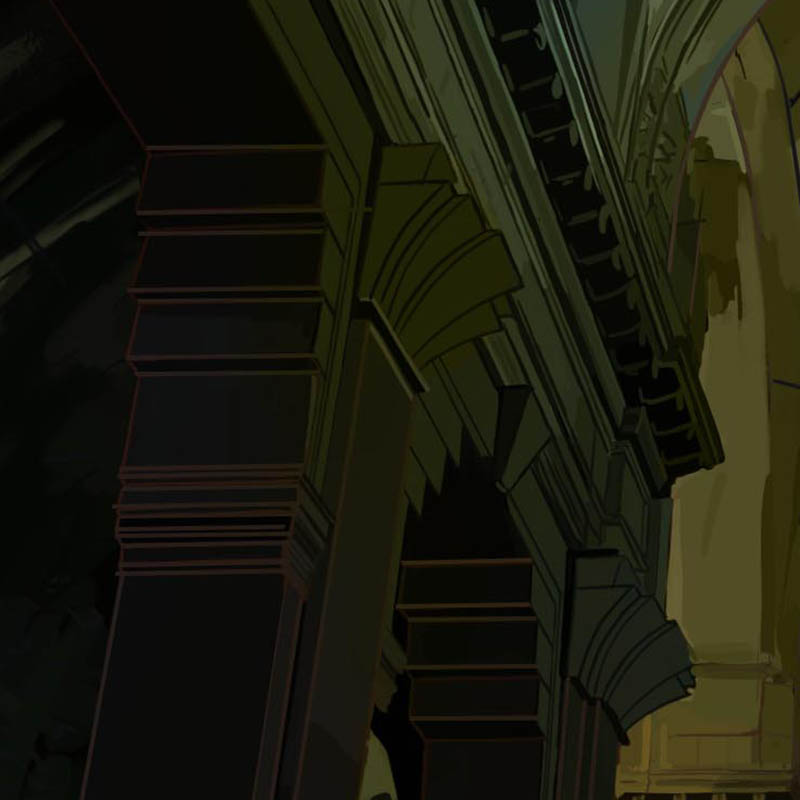
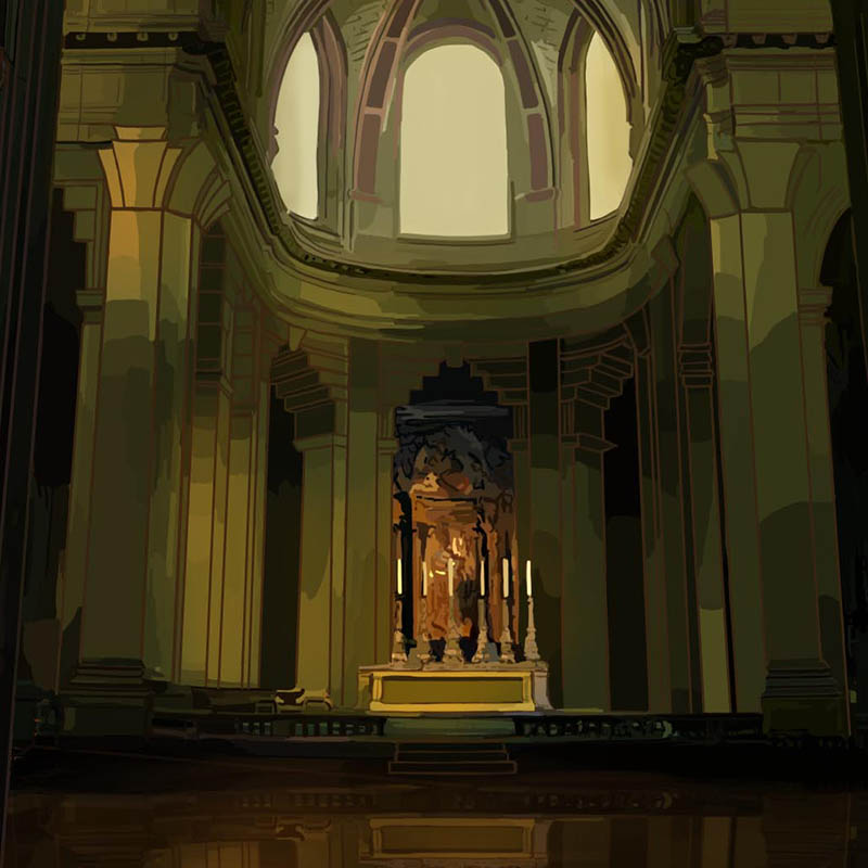
This illustration marks an evolution towards a more harmonious approach to line work, inspired by the graphic research found in early Disney films. By gradually moving away from the systematic use of black outlines, the colored line becomes more integrated with the shapes and overall atmosphere of the image.
The line therefore becomes an element of visual coherence: it supports the colors rather than contrasting with them, allowing characters and environments to exist within the same graphic universe.
The Line Serving the Atmosphere
The final evolution of this process consists of adapting outline colors to the overall atmosphere.
The line becomes an integrated element of the image rather than a separation between shapes.
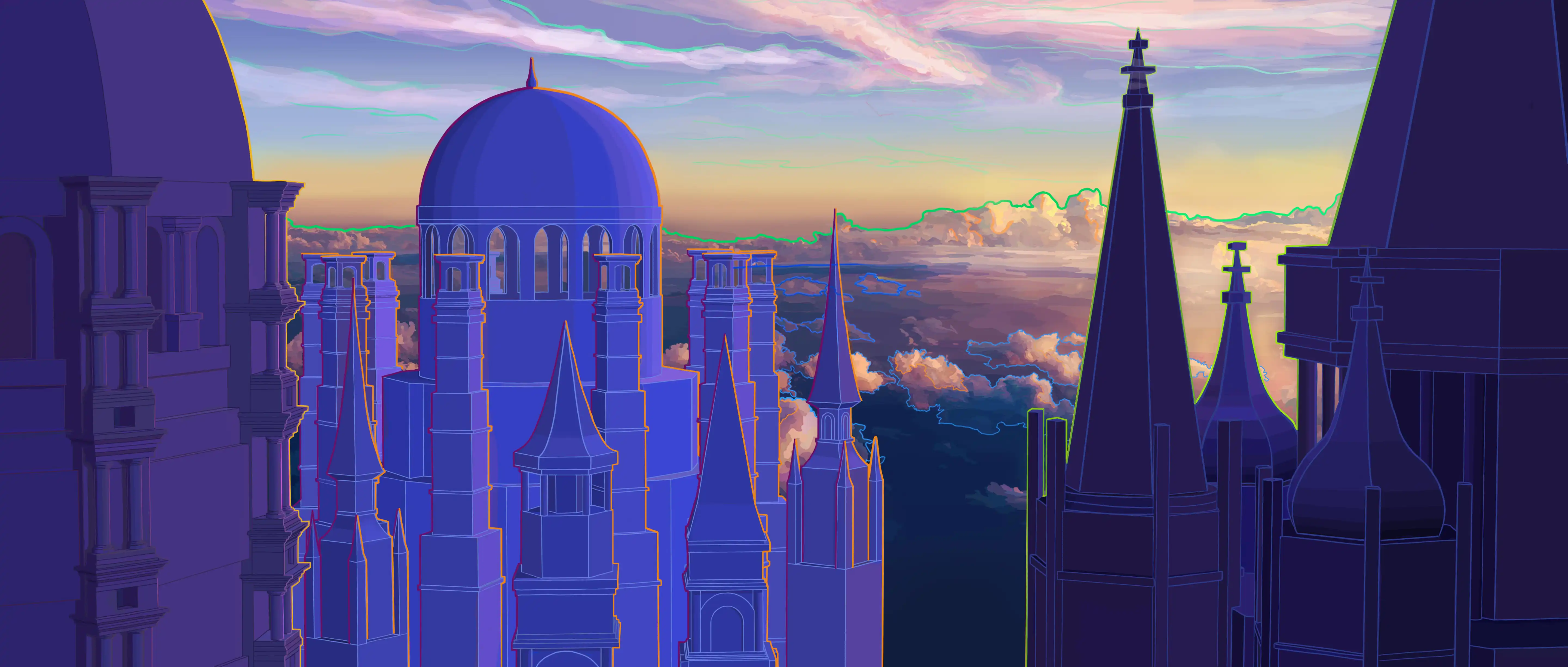
Exploring Saturation
This stage represents a new step in my experimentation, with the use of a more saturated line, deliberately different from the colors of the forms it outlines. The contour becomes a graphic element in its own right, helping to define a stronger visual direction and actively contributing to the composition.
The goal was to explore a different, more expressive aesthetic outside my usual approach.
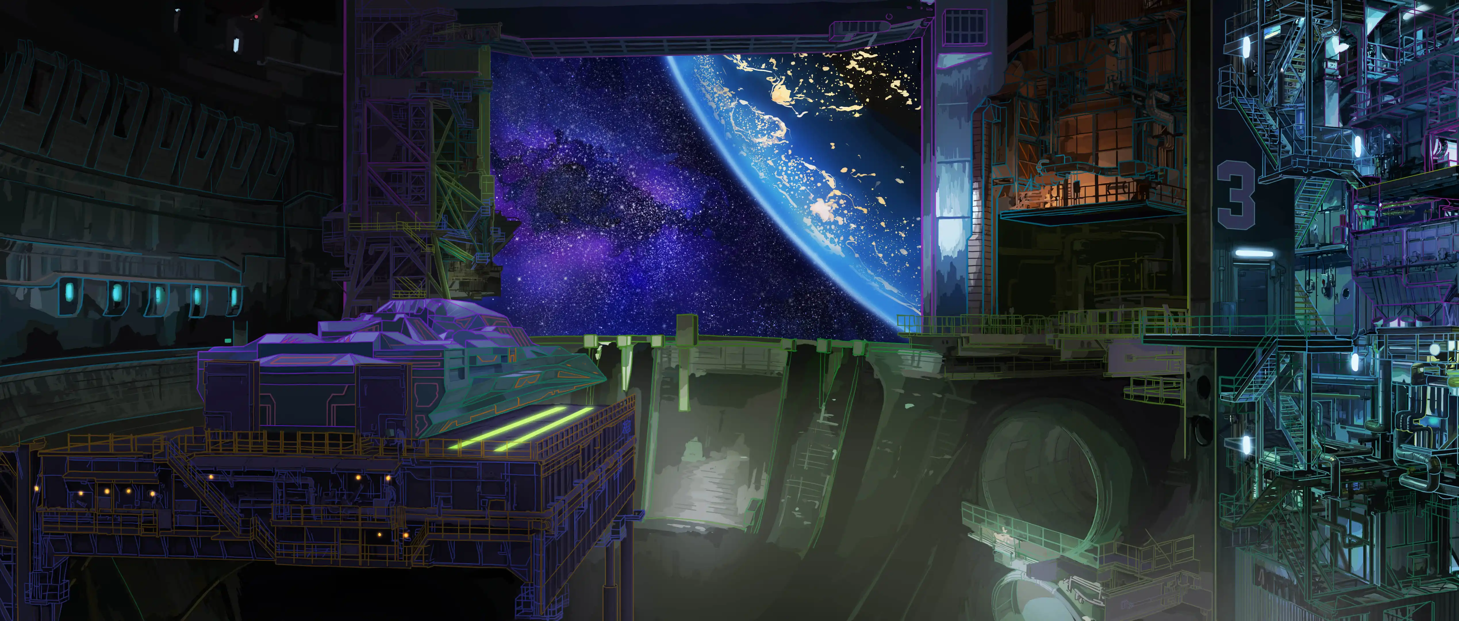
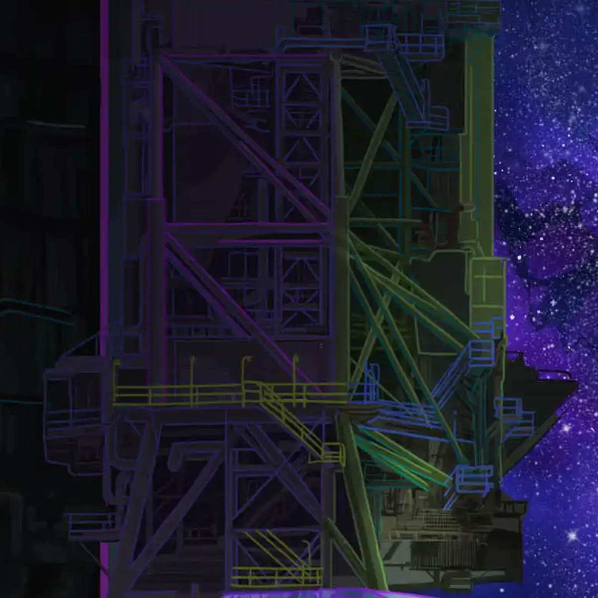
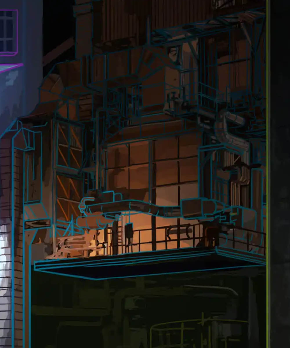
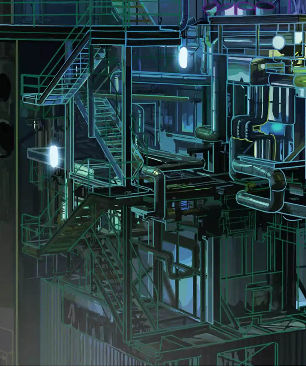
Two Approaches to the Line
Experiments with colored outlines continue through research into balance between structure, volume and internal details.
Two different color approaches are used to separate volumes and graphic elements.
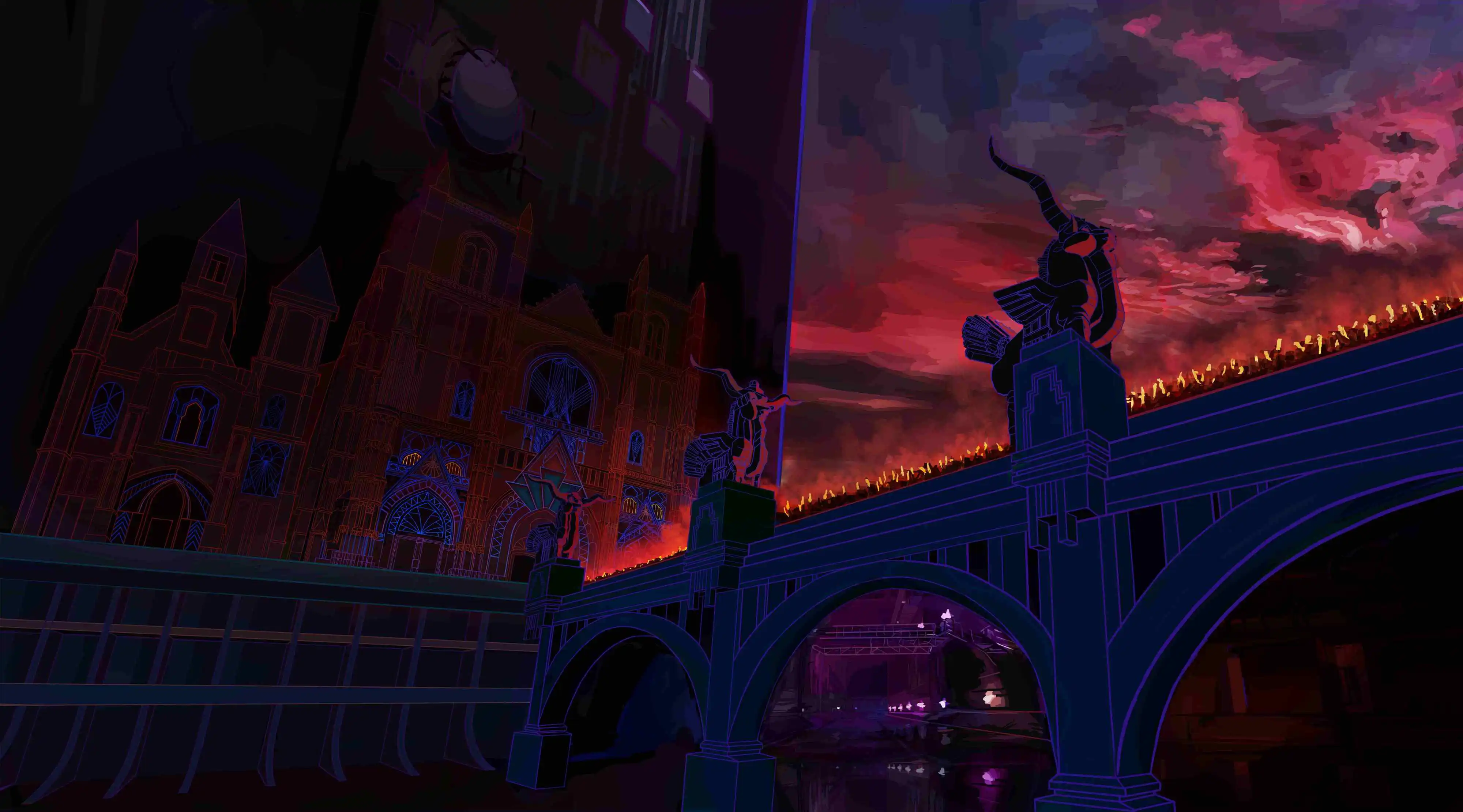
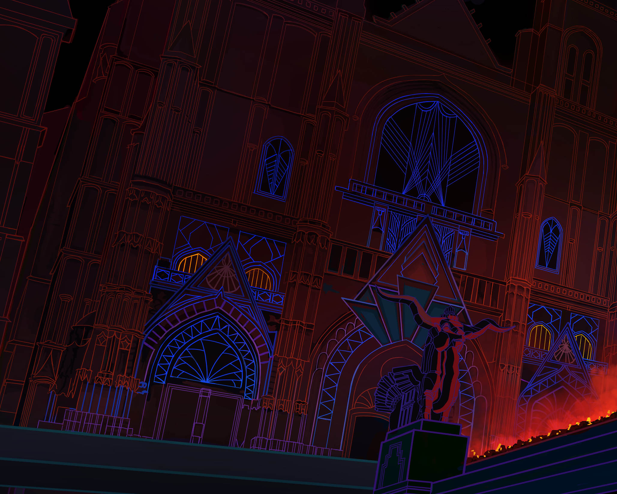
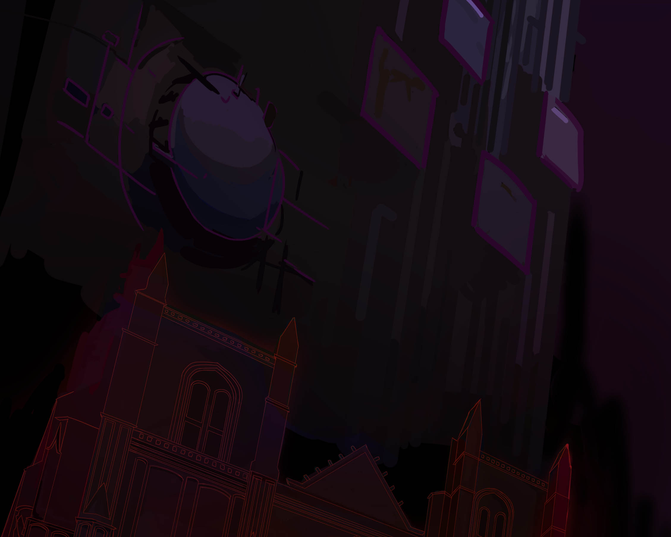
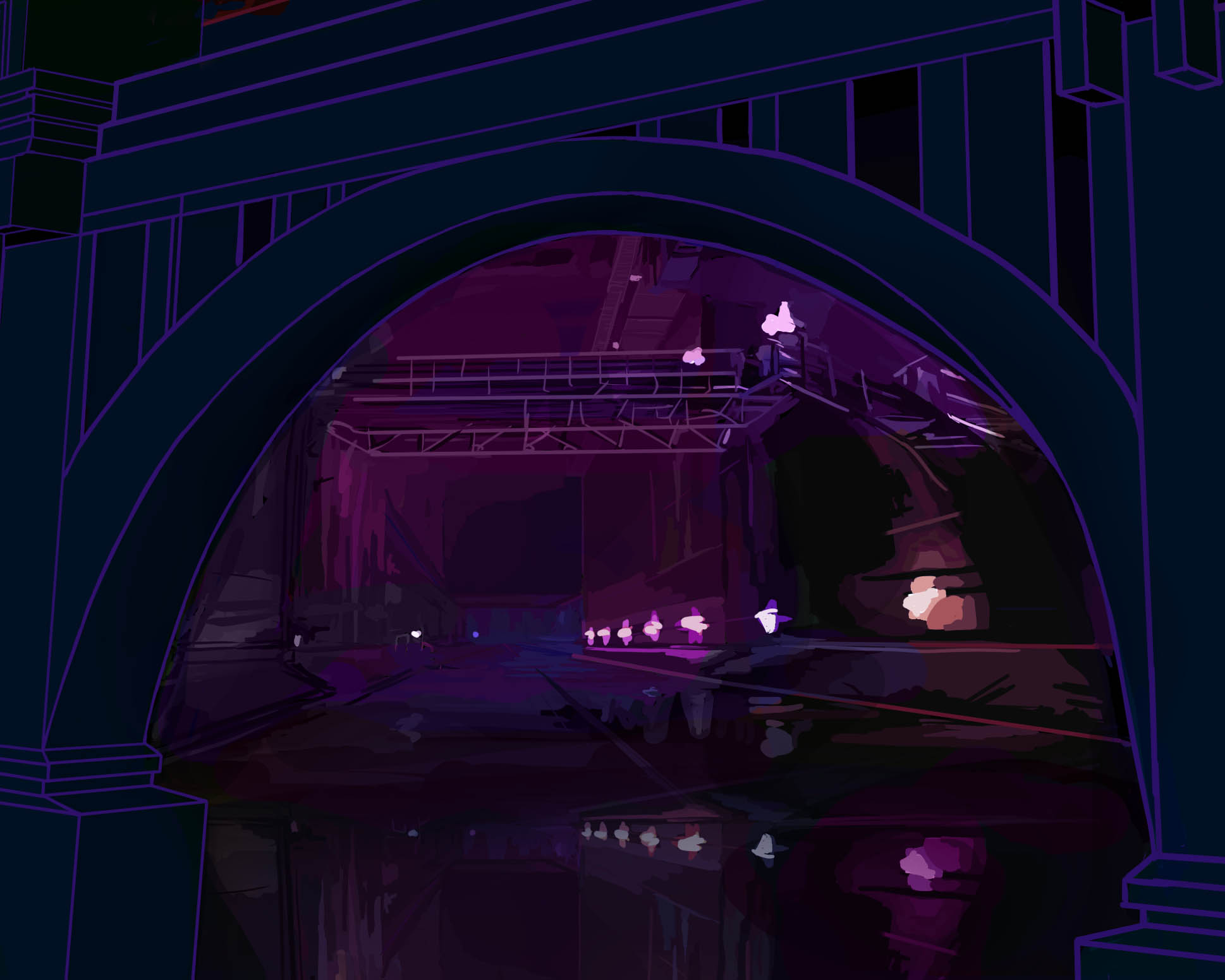
Building Through Color
The outline treatment evolves through different approaches depending on the elements represented.
Volumes use colors integrated into the environment, while patterns adopt a more graphic and contrasted treatment.
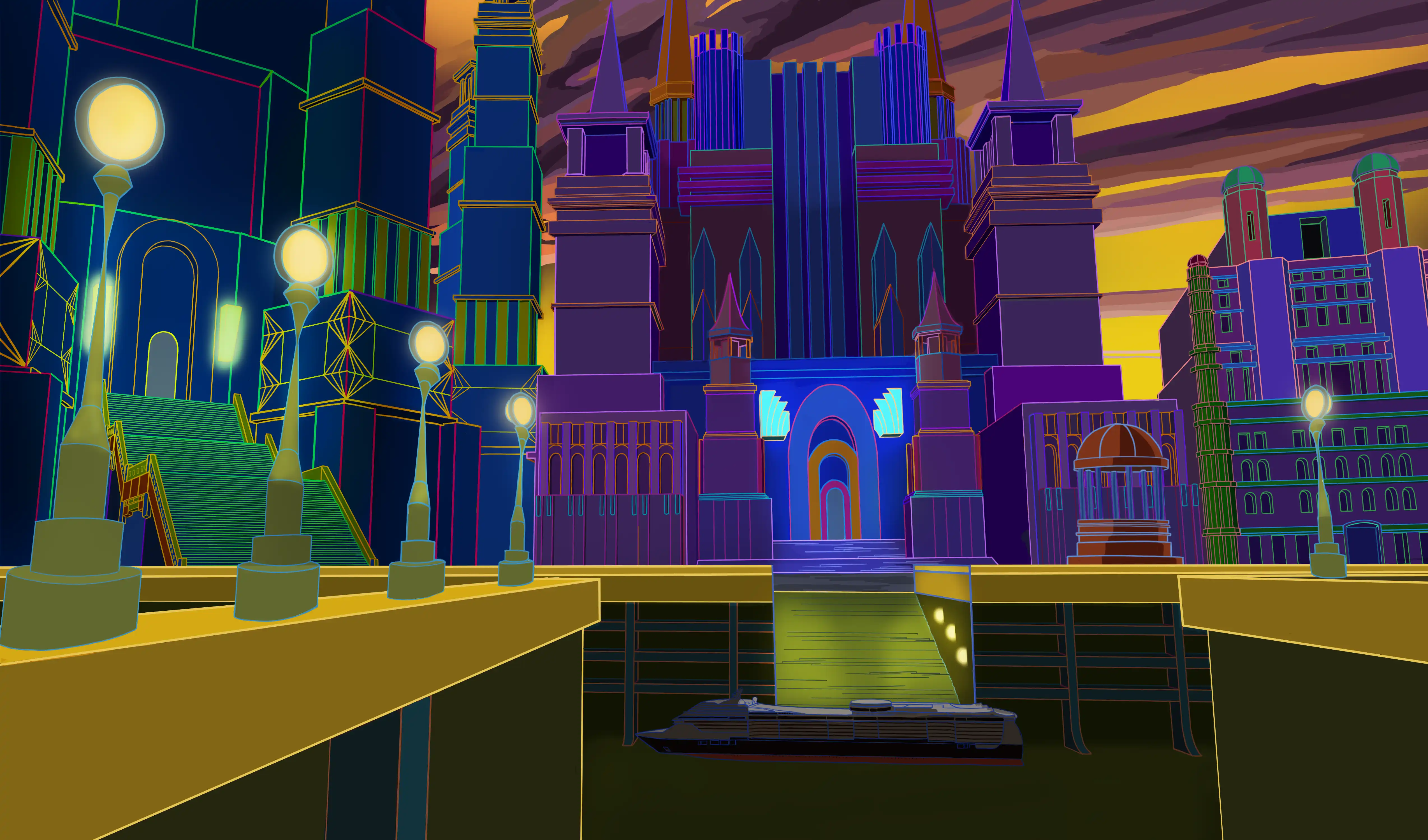

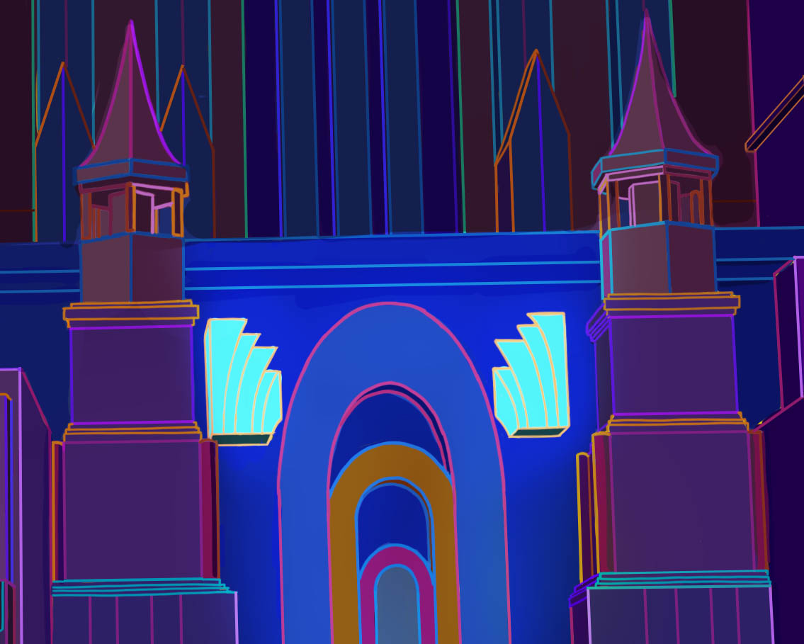
The Line as Light
Outline colors become an extension of the lighting work applied to surfaces.
Chromatic variations create different atmospheres and express a more personal approach to color.
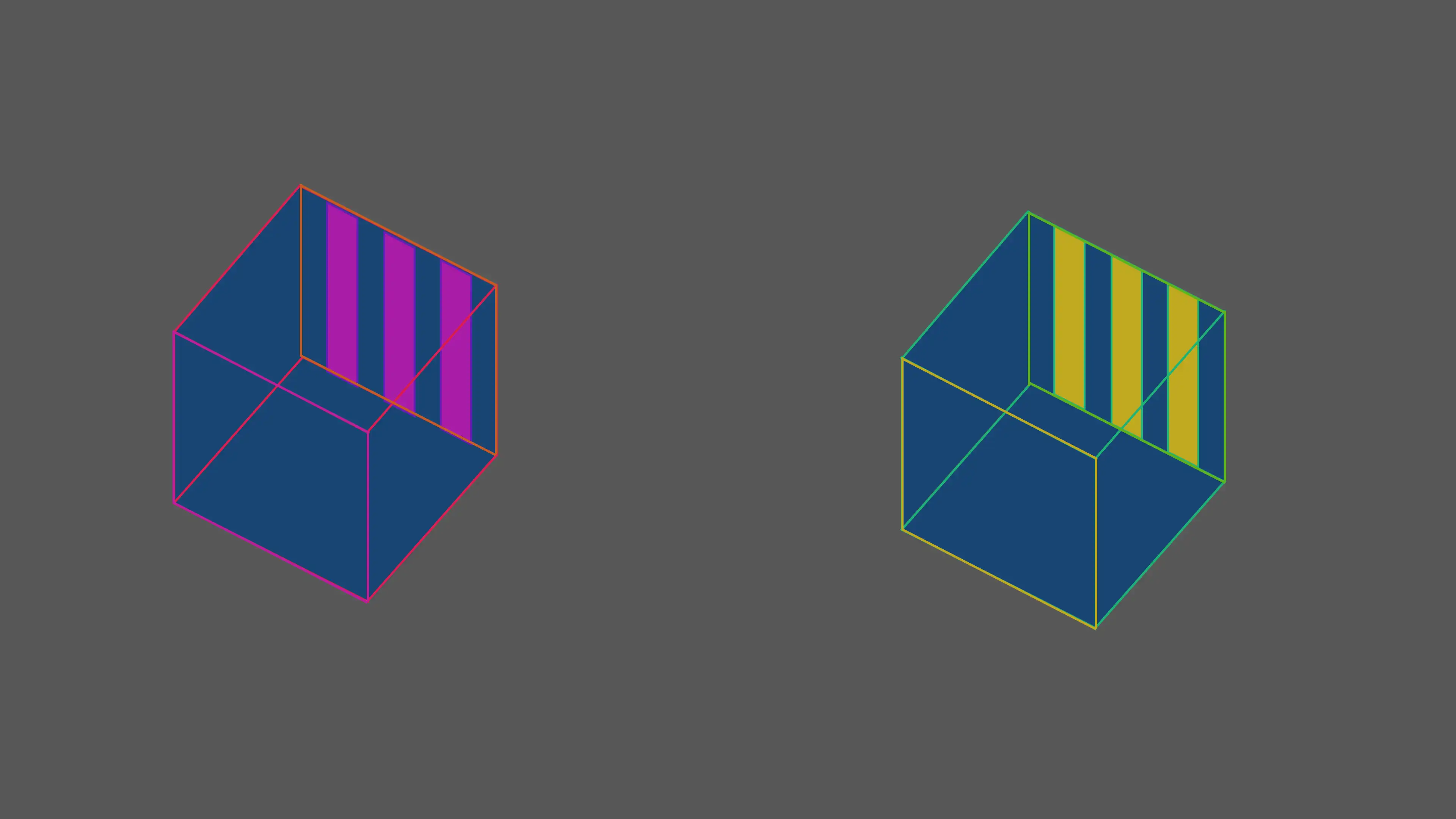
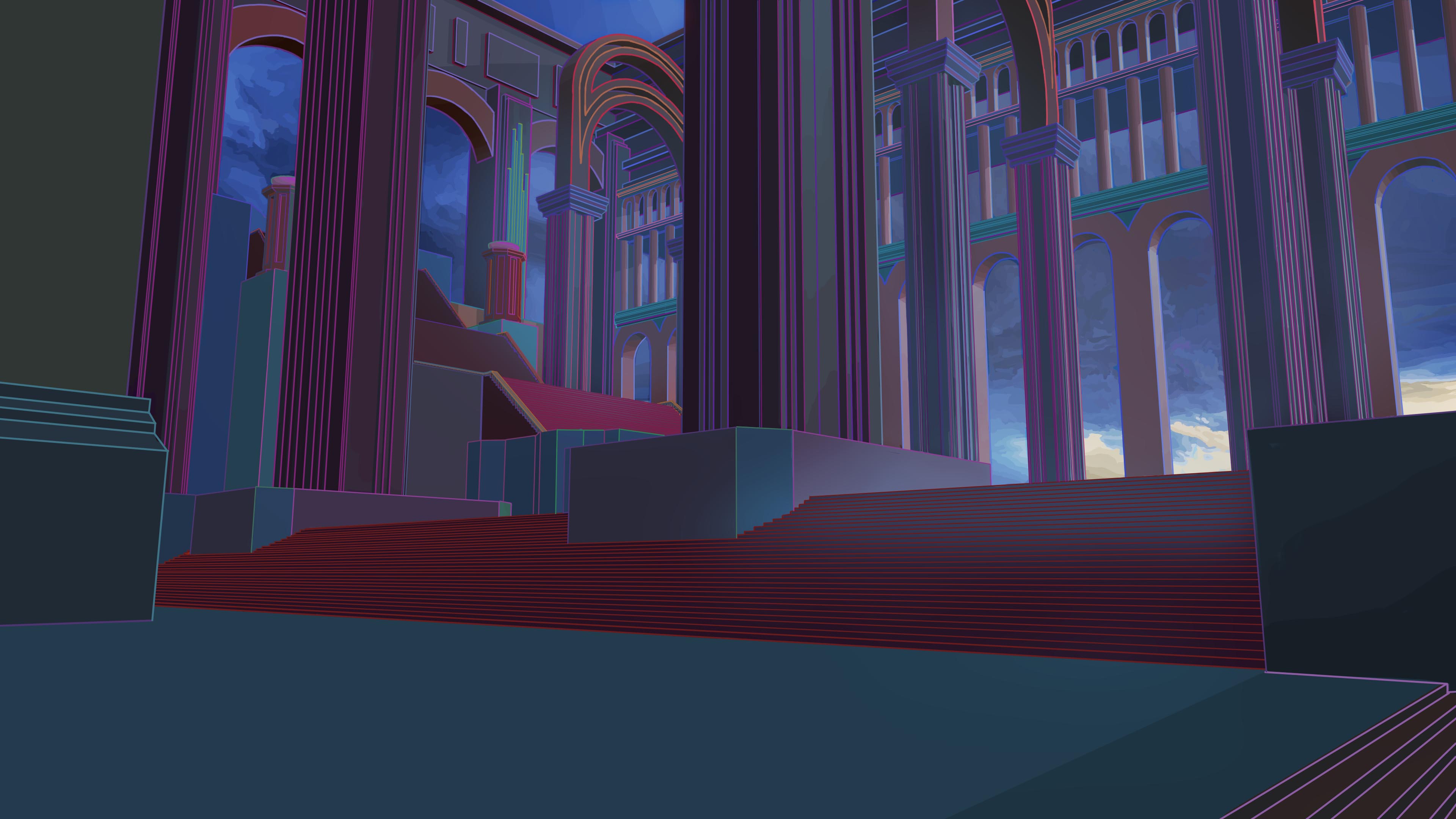
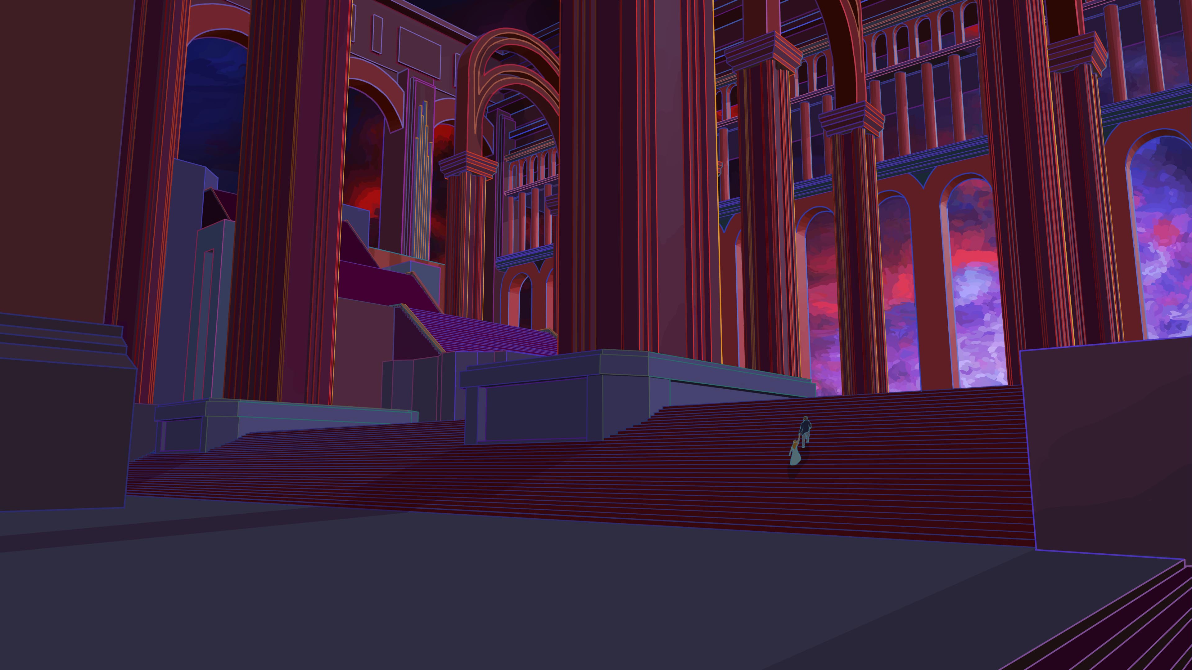
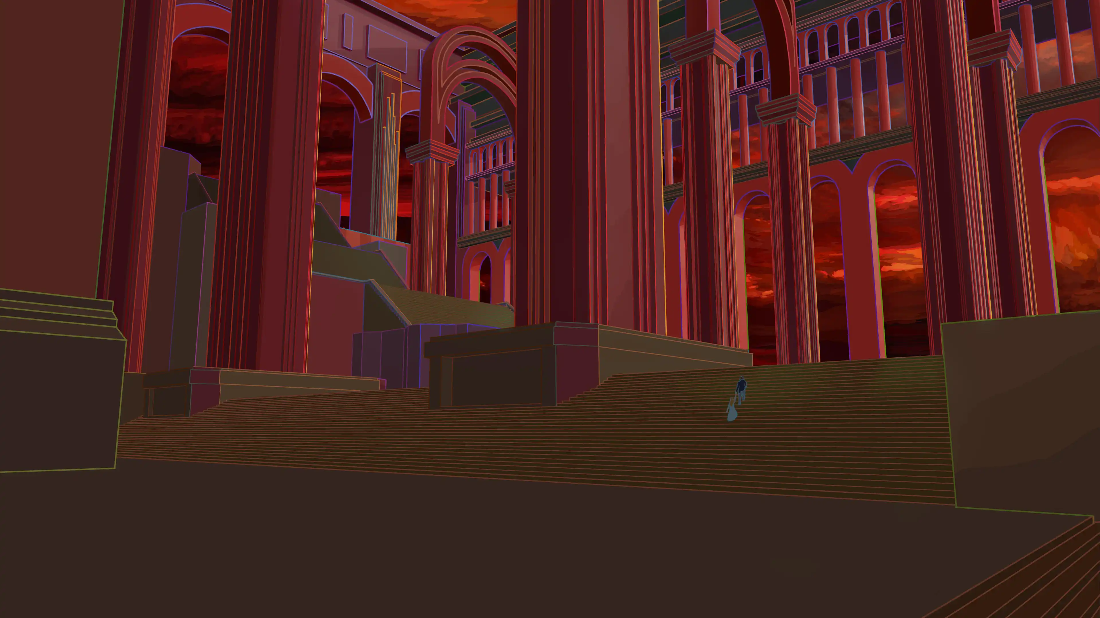
The Perception of Color
This stage reveals how colored outlines influence color perception.
Contrasts between lines and surfaces can transform the way the same color is perceived. This research echoes the work of Johannes Itten, who demonstrated how the perception of a color is shaped by its surrounding colors.
Color as Storytelling
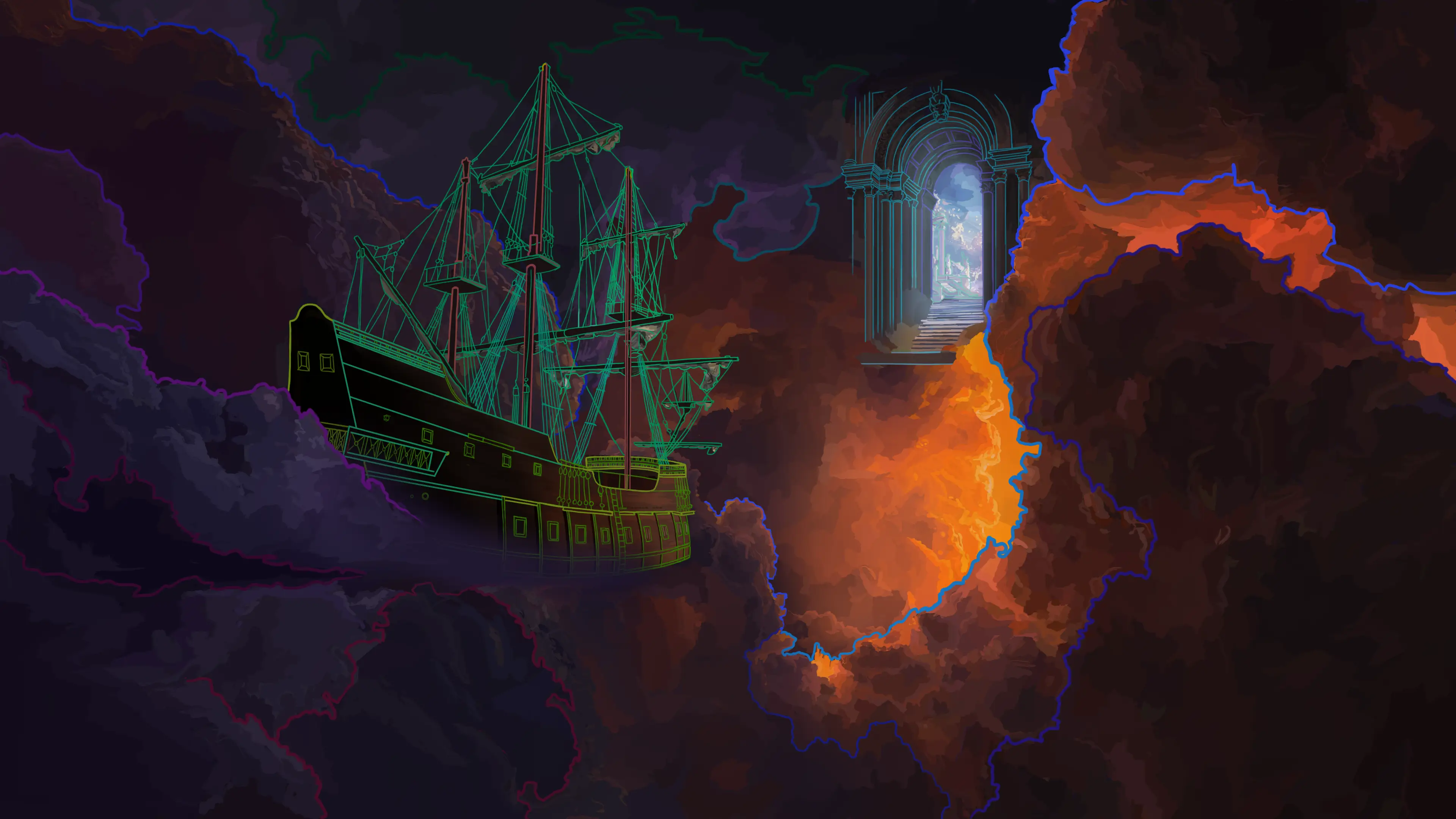
Final experiments show how slight color variations can dramatically change the atmosphere of an image.
Like the paintings of Denis Frémond, where light and subtle chromatic harmonies are enough to create singular worlds, color becomes a language capable of suggesting a place, an emotion, or a story.
Or, much like Mark Rothko, who transforms simple fields of color into spaces of contemplation: each variation in tone contributes to the construction of a visual universe and guides the viewer’s perception.
Exploring Before Building
These studies gather experiments, tests and different paths explored before reaching a final direction.
They reveal a process where mistakes and exploration play an essential role.