Fondations - processus créatif
Introduction
Trouver une identité visuelle cohérente a été le fruit d’un processus long et évolutif. J’ai exploré de nombreuses directions avant de parvenir à un style qui me ressemble. À travers cette page, je souhaite partager ce cheminement : les hésitations, les influences, les choix qui m’ont permis de construire un langage graphique personnel. C’est aussi une manière d’ouvrir un nouveau chapitre, en invitant le regard à suivre cette évolution.
Premiers repères
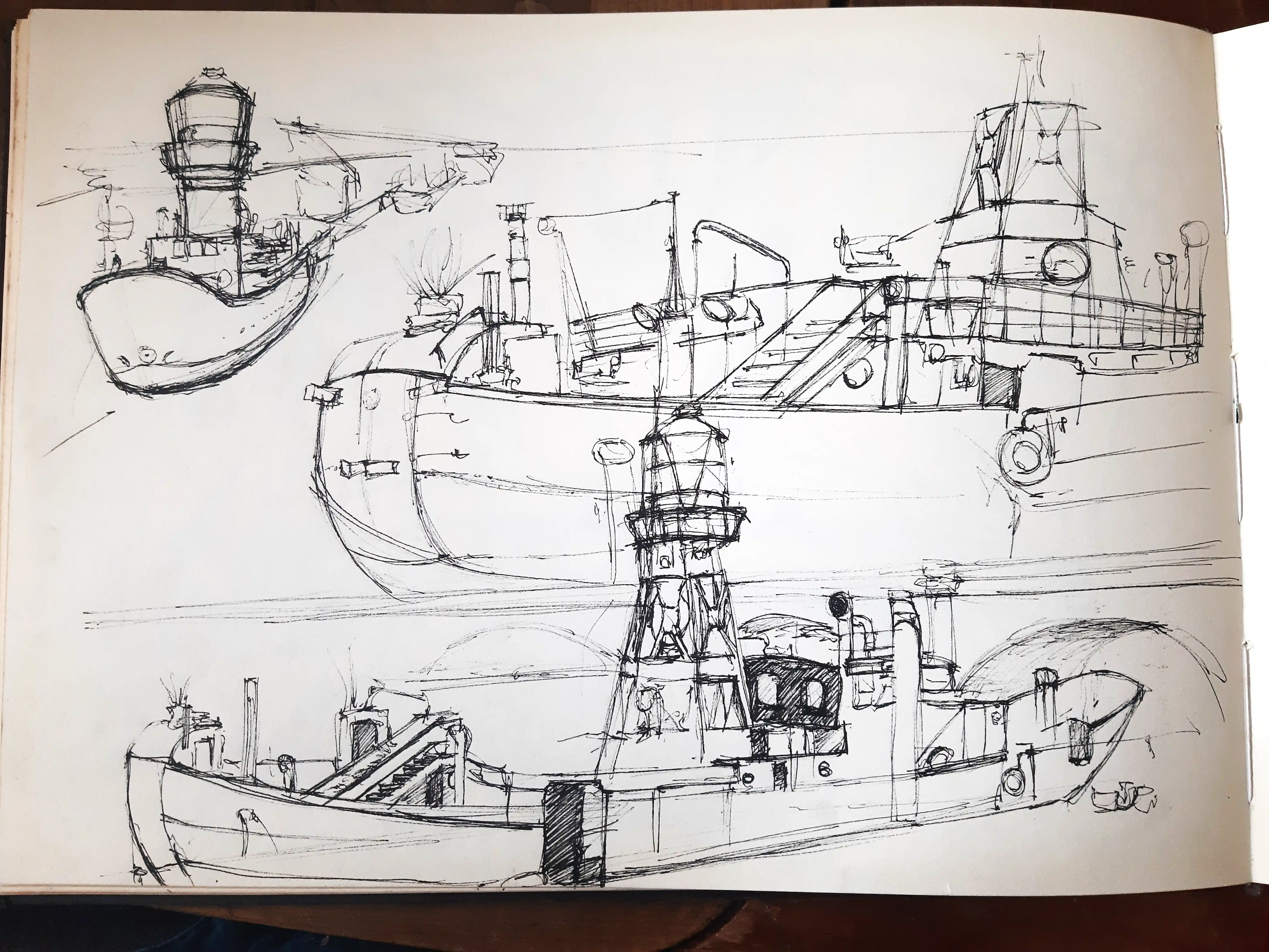
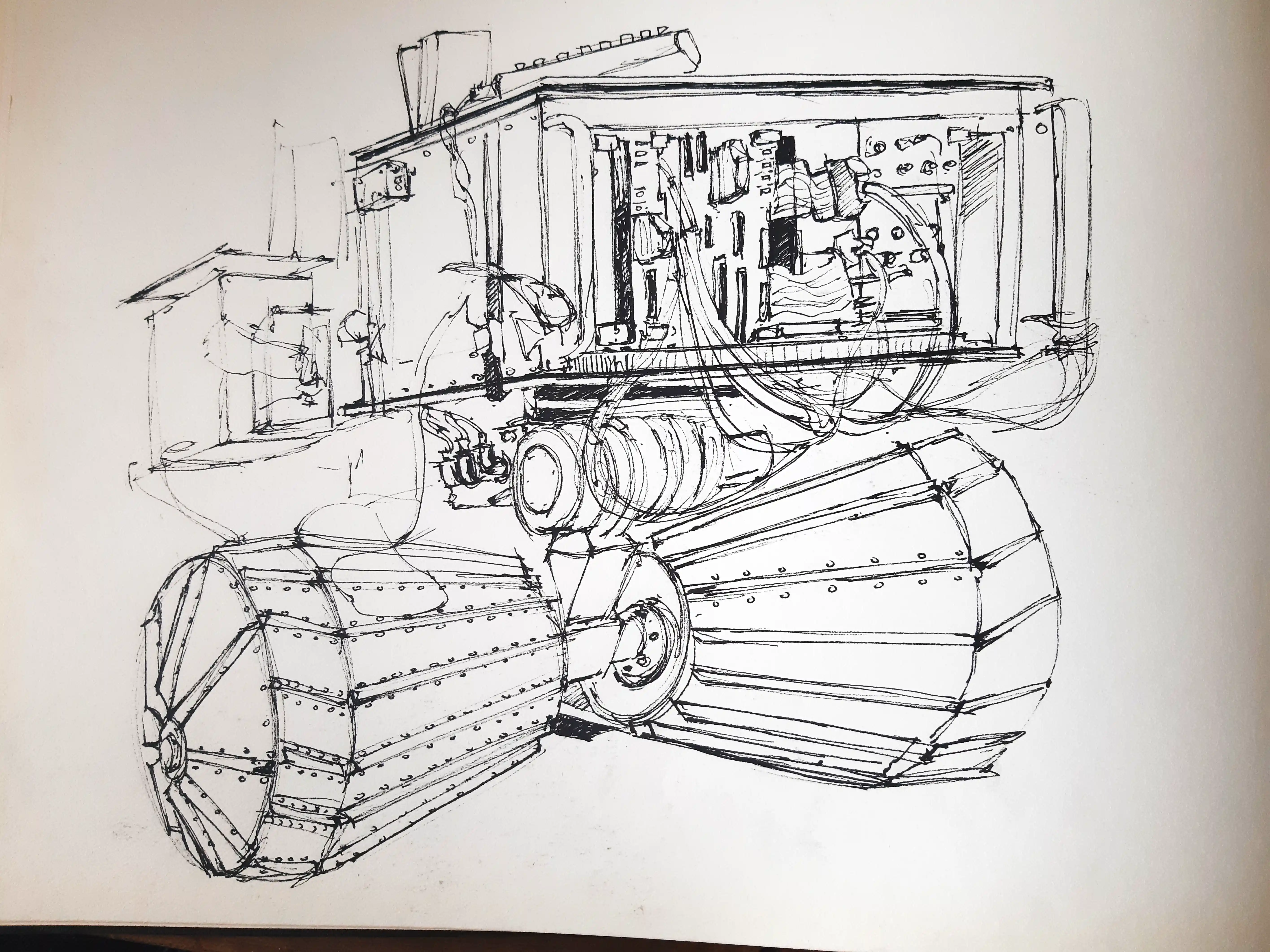
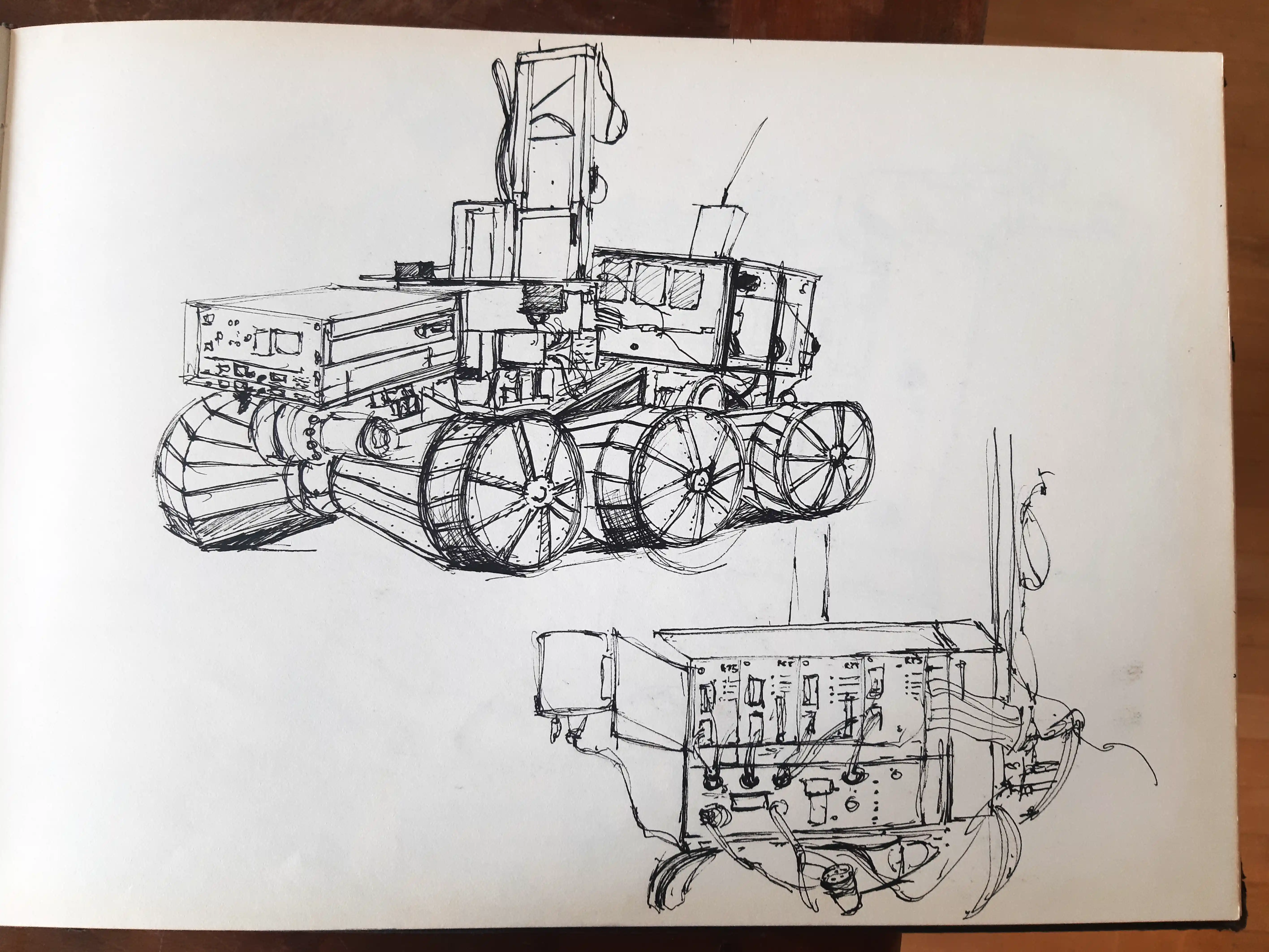
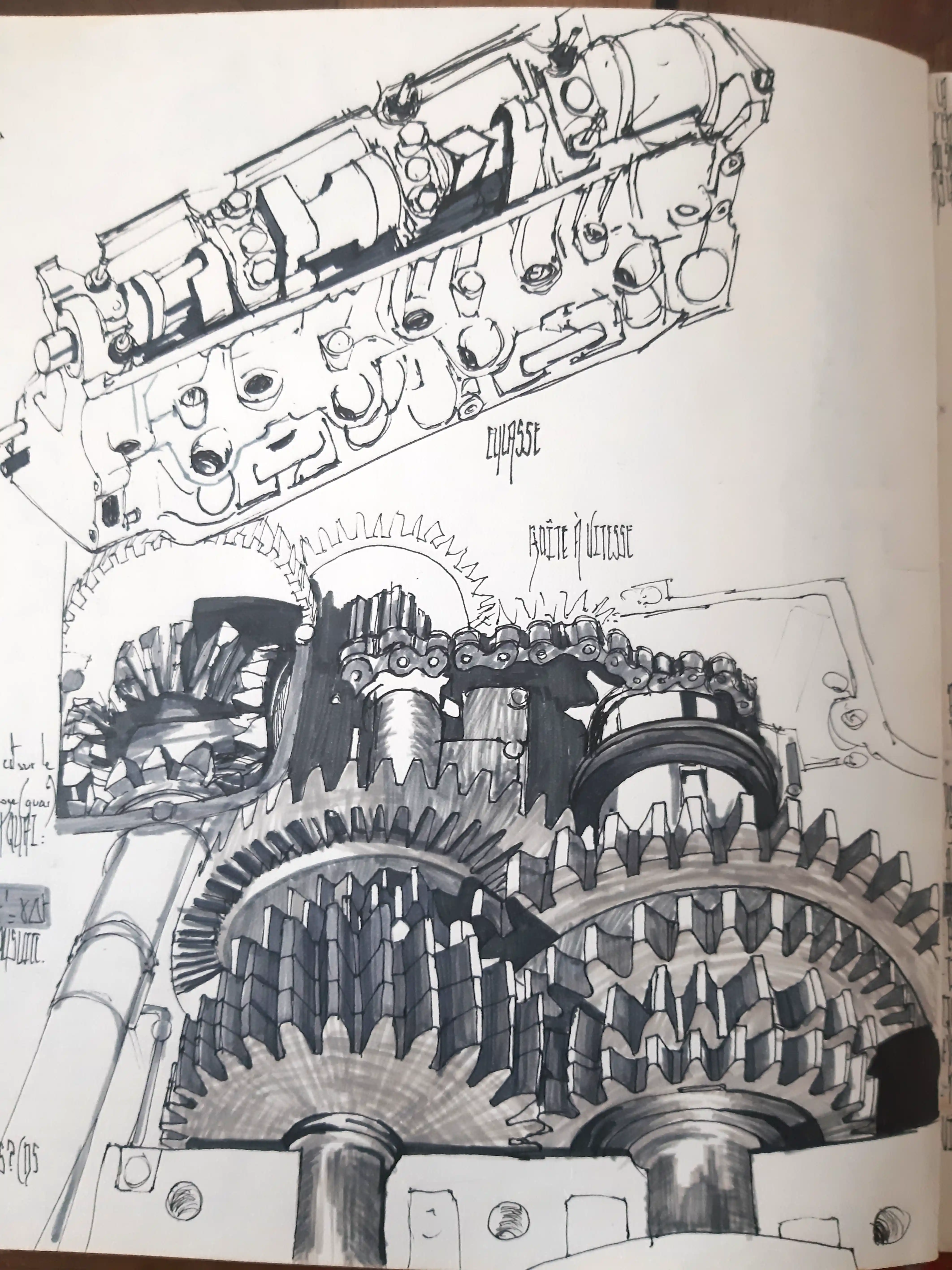
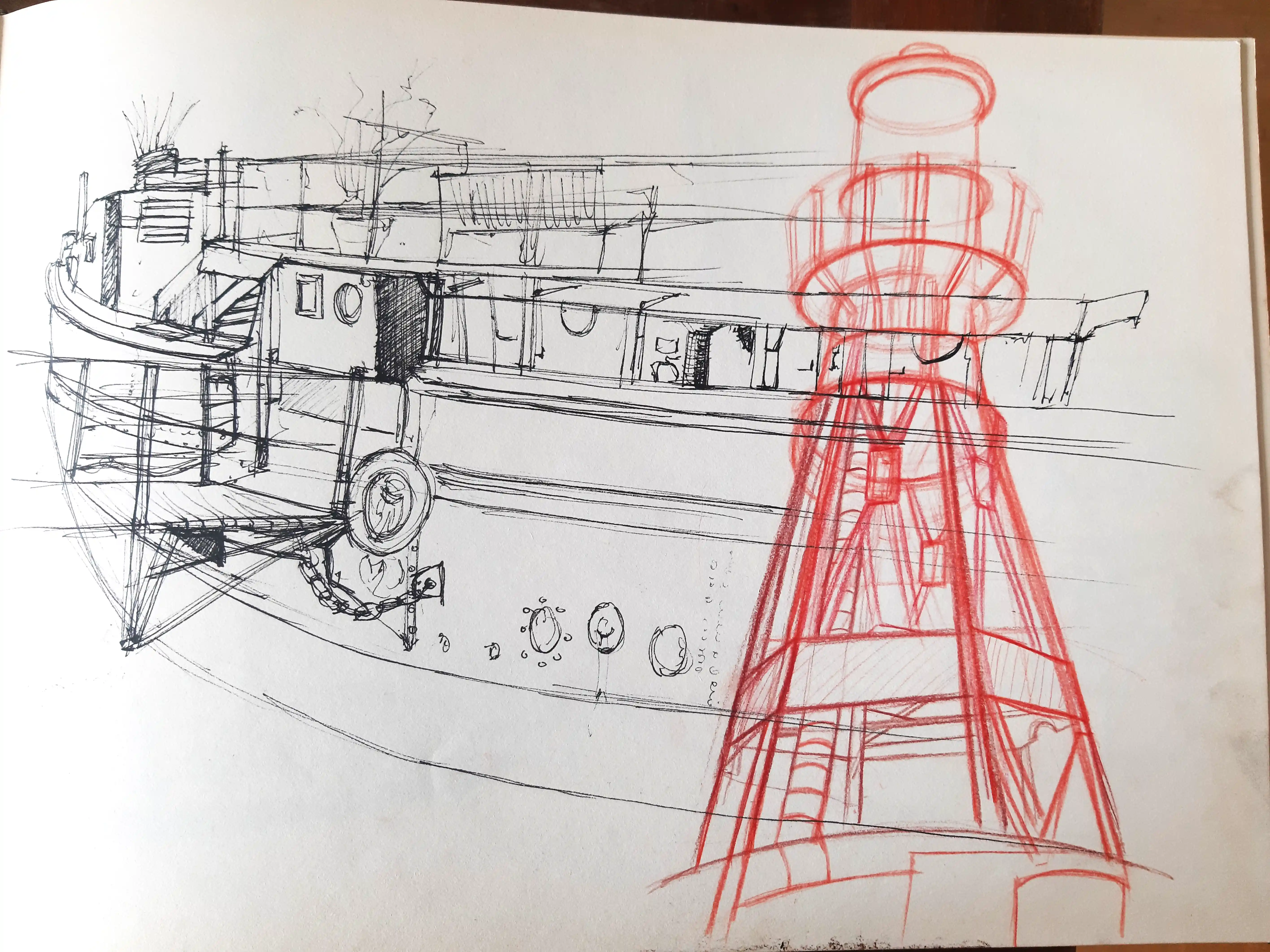
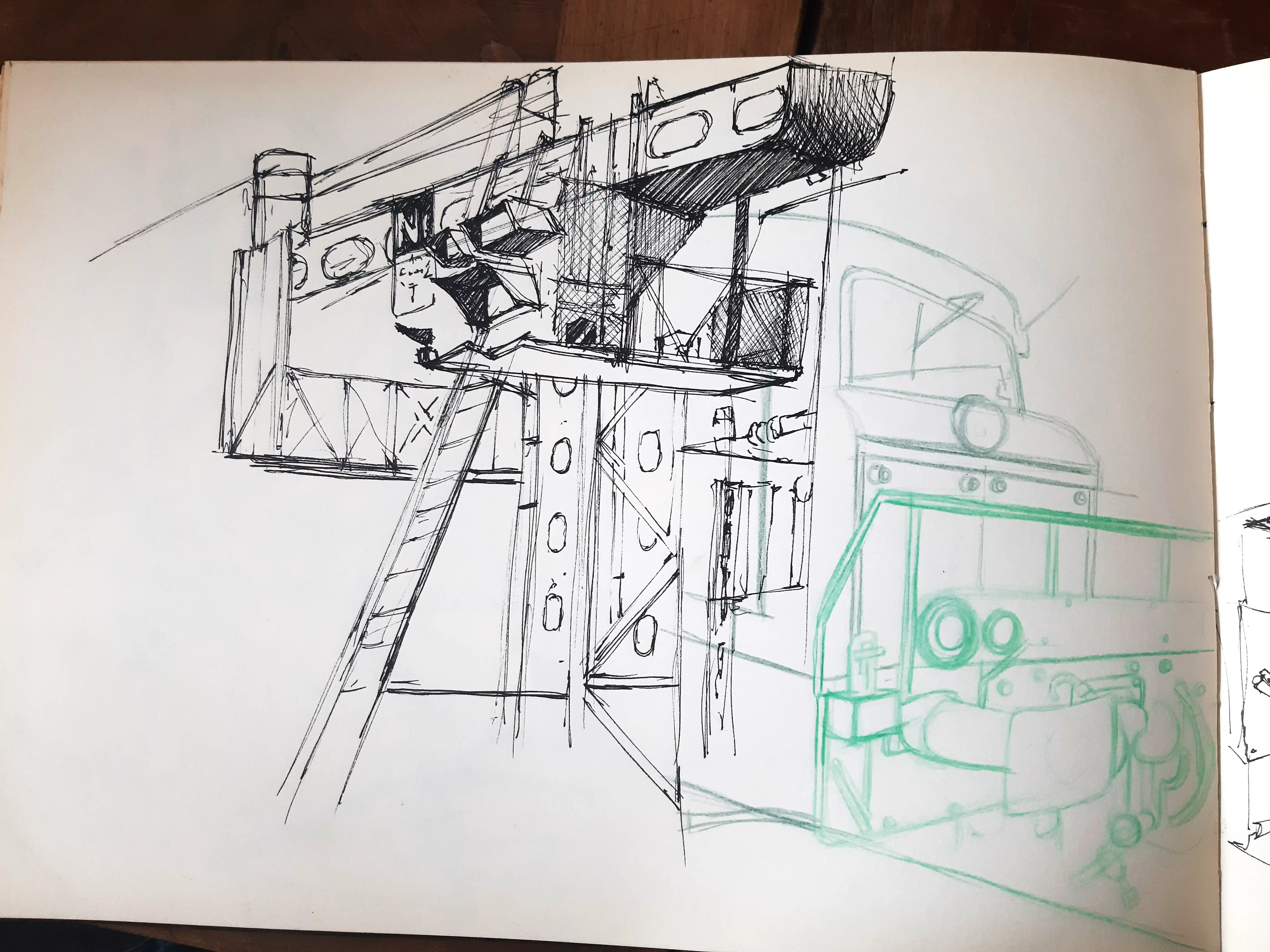
Je dessinais surtout dans des carnets, au feutre noir, avec des traits rapides. La découverte des carnets de James Jean m’a poussée à explorer d’autres pistes : superpositions, transparences, compositions plus libres ; ainsi qu'un jeu des couleurs qui permettaient de repenser la composition en jouant sur la profondeur.
Etape décisive
Pendant la crise sanitaire, j’ai repris le dessin pour lui donner un sens et un rôle d’expression. J’ai appris Photoshop et expérimenté le photobashing, mais j’ai constaté une certaine uniformité dans le photoréalisme. Malgré mes échanges avec des professionnels, aucune réponse claire n’est venue. J’aime la simplicité du dessin et des contours noirs, qui facilitent la lecture. J’ai alors créé une série de dessins où je m'affranchis de cette mode au photoréalisme.
Processus
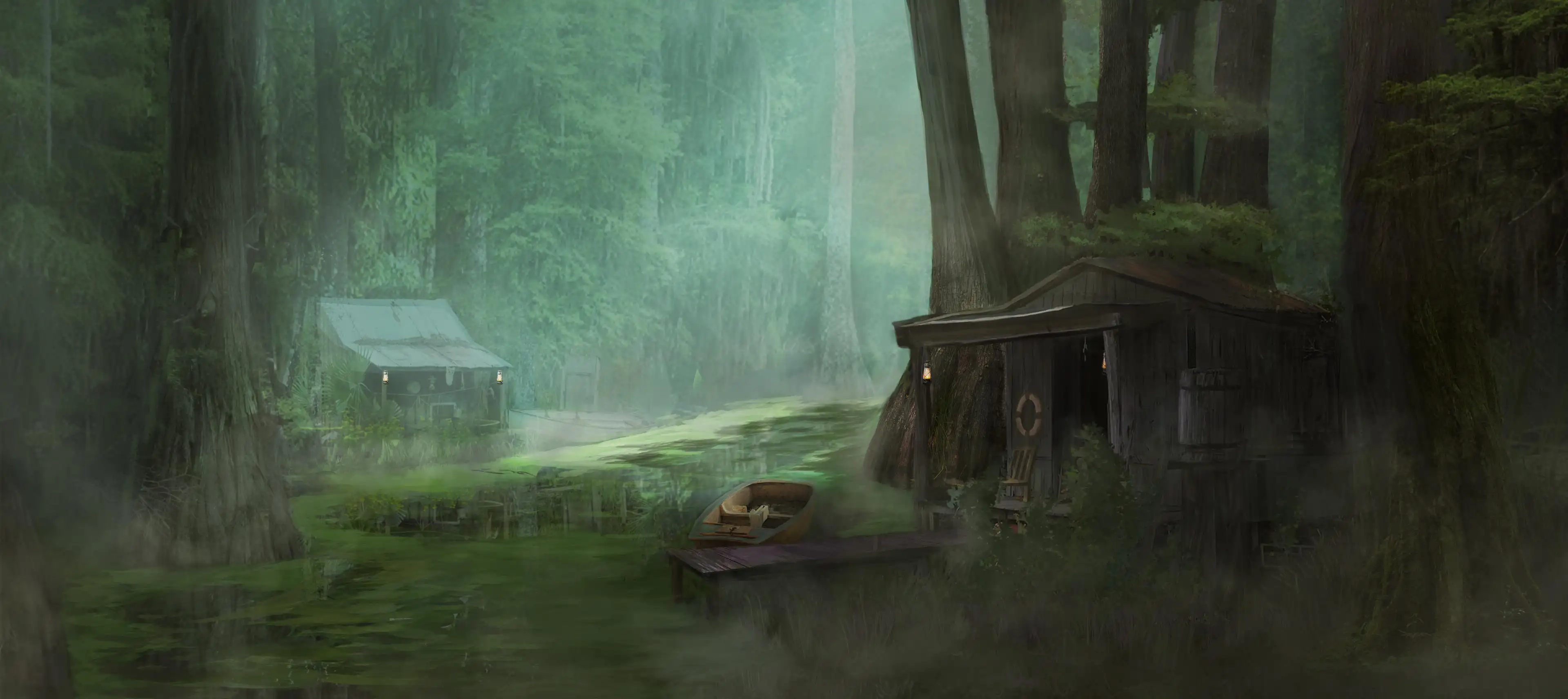
Au début, j’ai repris naturellement le dessin que je pratiquais dans mes carnets. J’ai intégré la couleur au processus. La lumière est traitée spécifiquement sur le point d’intérêt de la scène, tandis que le reste est abordé de façon plus graphique.
Le premier déclic est venu de mon rejet du contour noir, que je trouvais trop envahissant visuellement.
Je me suis rappelée un documentaire sur les illustrateurs de l’époque Walt Disney, confrontés à la même problématique.
Ils coloraient la ligne pour harmoniser les personnages avec le décor.
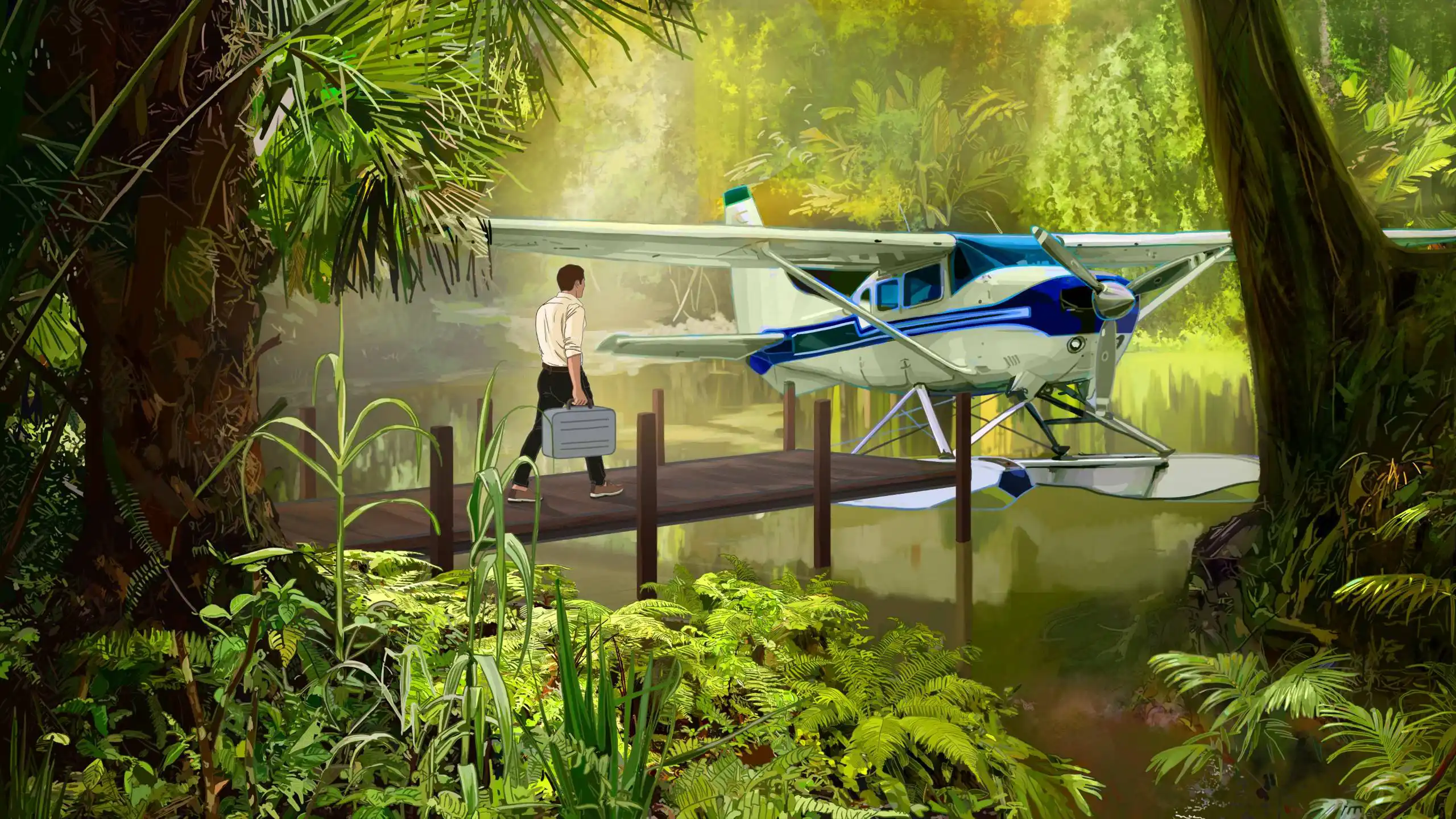
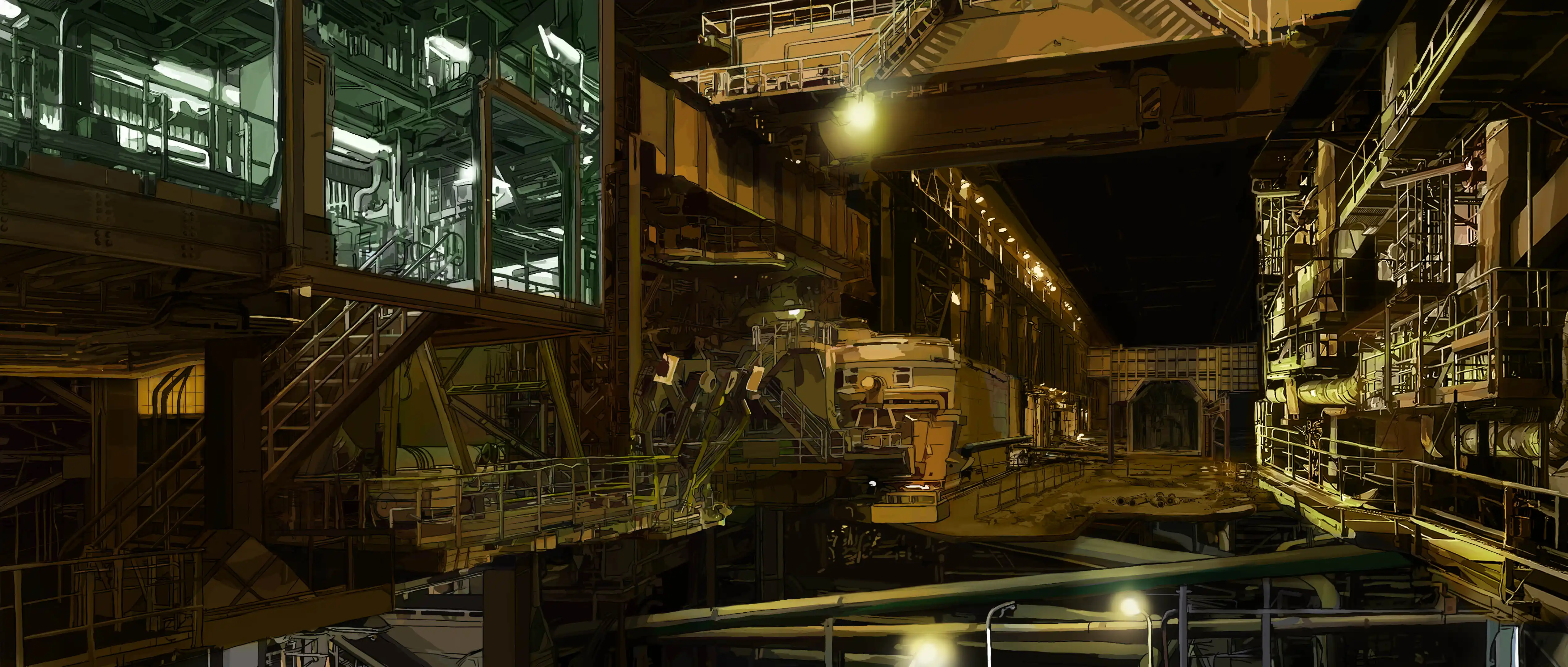
D'ailleurs, dans les dessins animés, le décor est davantage soigné, avec un travail de la lumière plus accrue. Les personnages sont traités avec un contour noir et des aplats de couleurs. De cette façon, les personnages se détachent bien. Je vais m'inspirer de cette approche dans un premier temps.
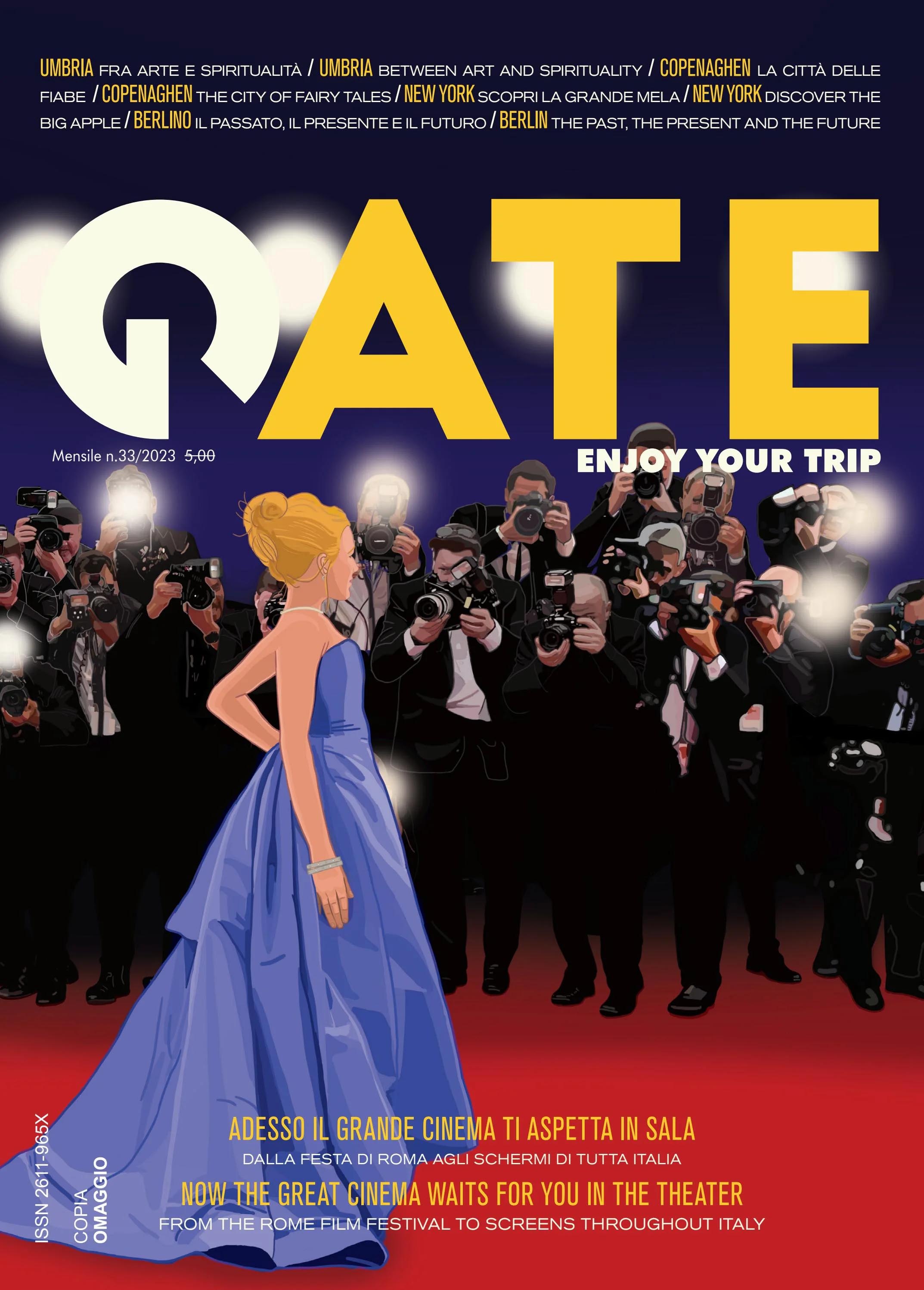
Je me suis inspirée de cette approche pour réaliser cette couverture, avec une référence notable à Cendrillon.
J’ai ensuite commencé à varier discrètement la couleur du contour, en tenant compte de l’atmosphère afin qu’il s’intègre à l’ambiance sans la perturber.
J’ai alors décidé d’oser saturer la ligne, sans savoir où cette expérimentation me mènerait ni si elle fonctionnerait. Me disant que si personne ne l’avait fait avant, c’était sans doute pour une raison. Mais j'avais vraiment envie de faire quelque chose de très graphique, différent de ce que je fais habituellement.
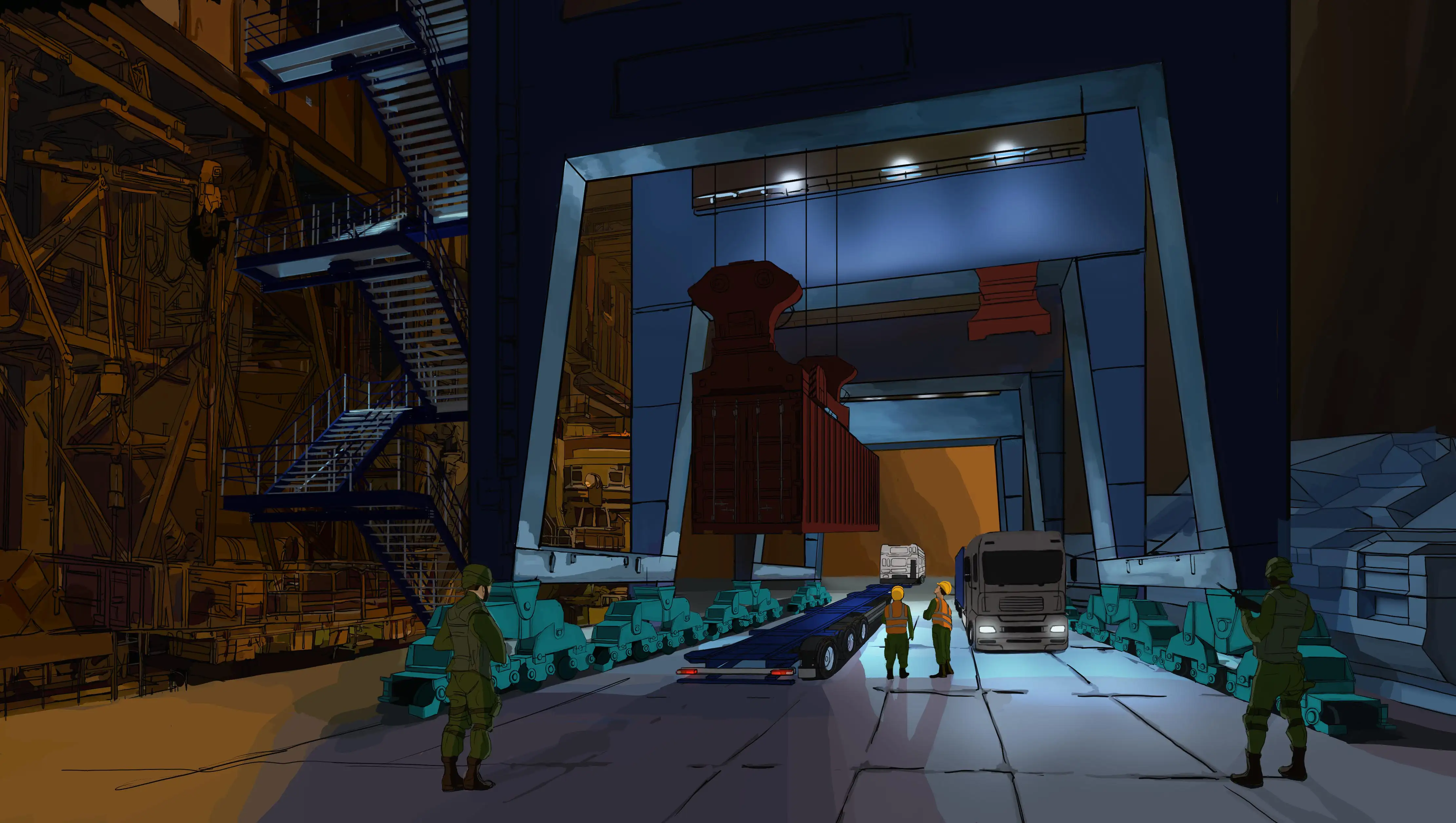
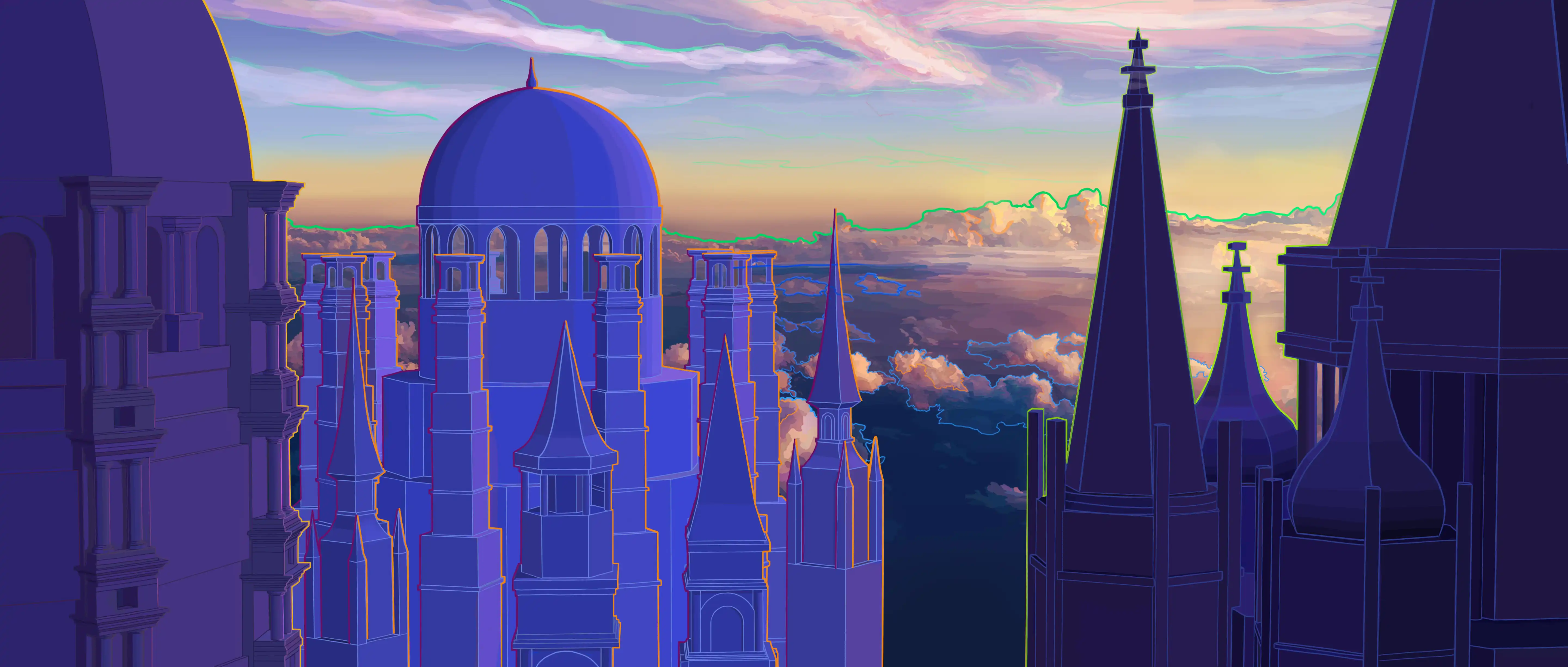
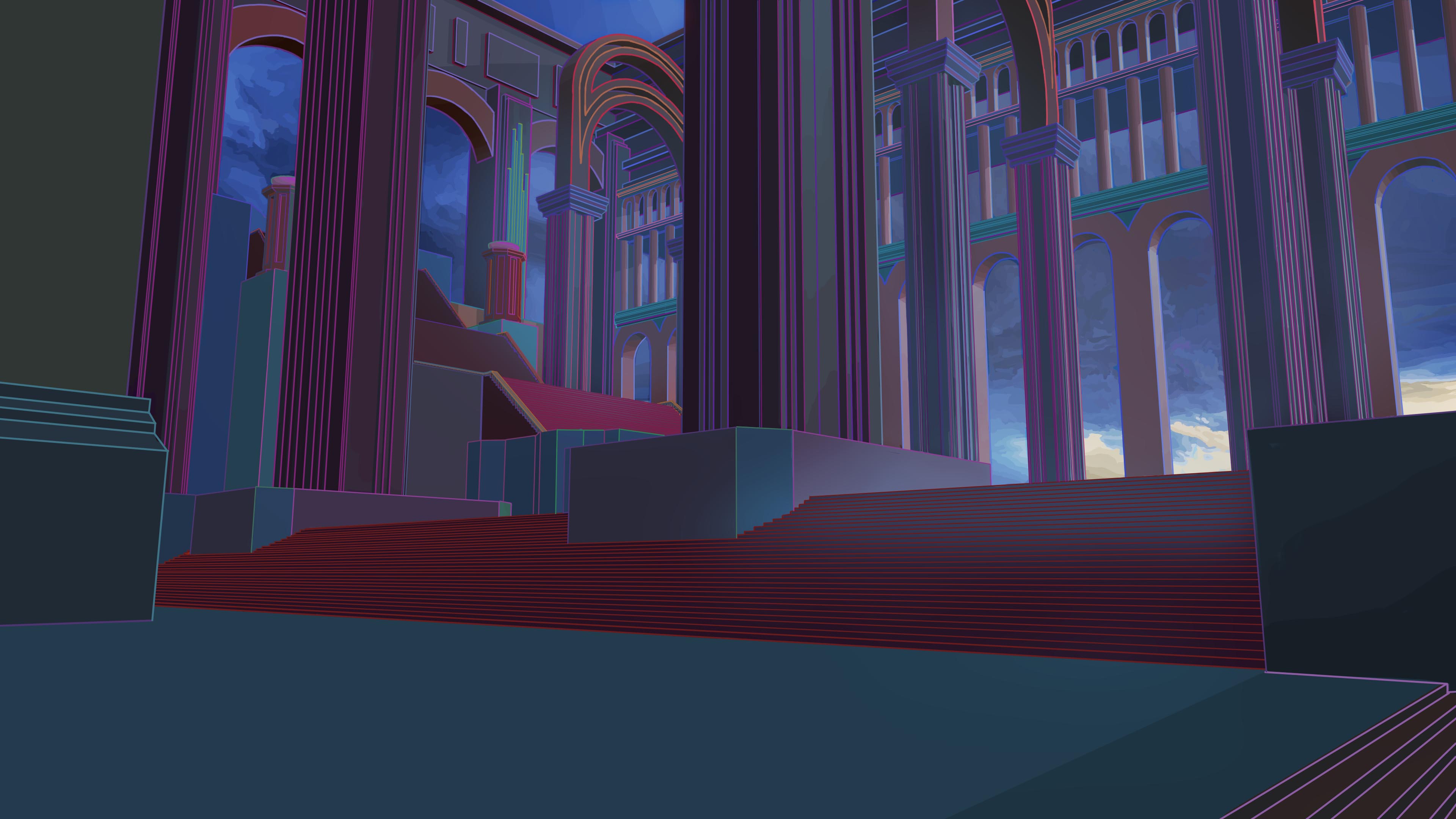
Après des essais concluants, j’ai poursuivi mes expérimentations. Le contour coloré s’est avéré plus complexe à gérer : il doit à la fois délimiter le volume des formes et distinguer les motifs à l’intérieur, comme les rambardes ou les barreaux. J’ai choisi de travailler sur deux plans distincts, avec deux approches de couleur différentes.
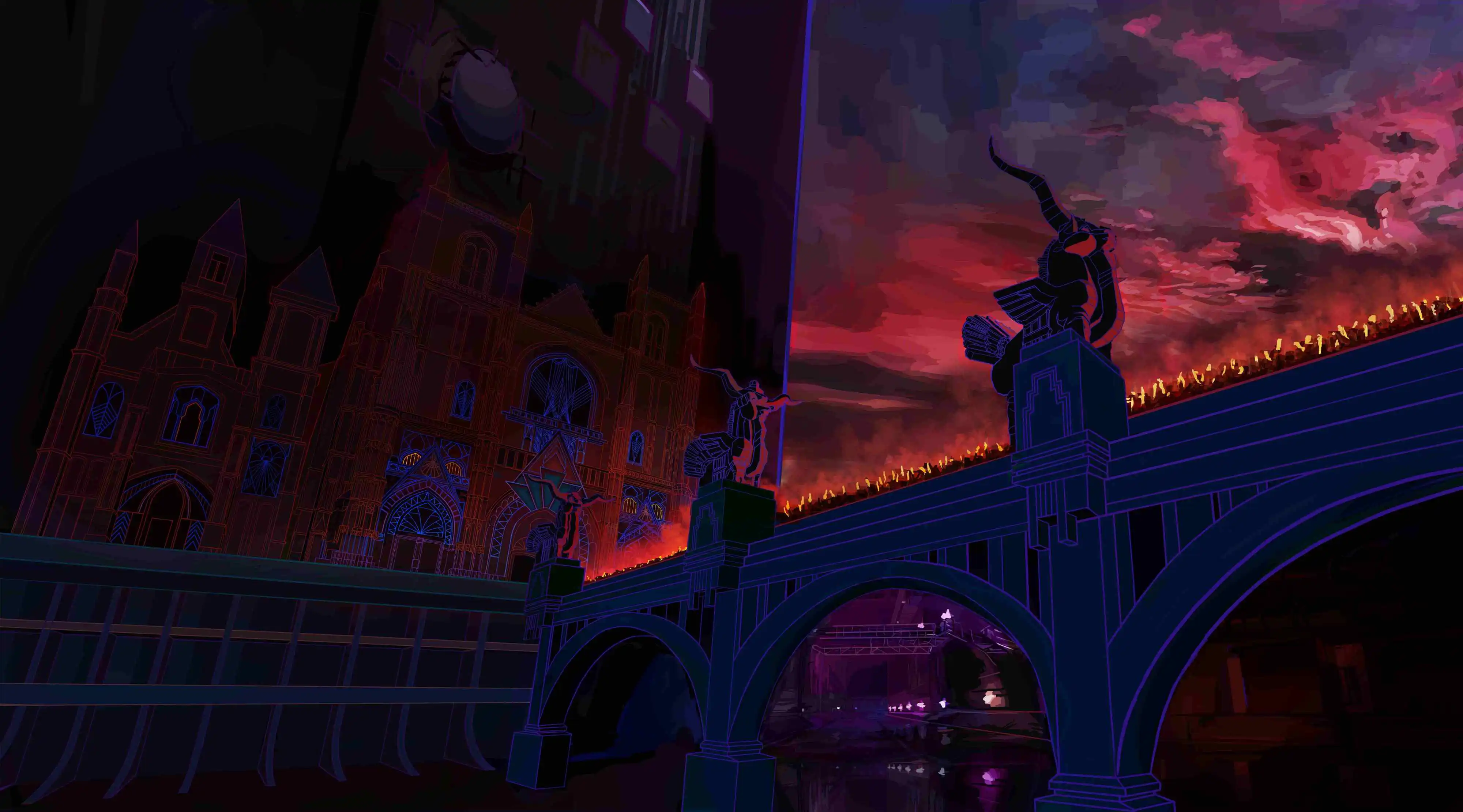
Pour le contour des volumes, j’ai adopté une approche classique, avec des couleurs discrètes qui s’intègrent au décor tout en restant visibles. Pour les motifs, le rendu est plus graphique, avec des lignes saturées qui se détachent nettement du volume.
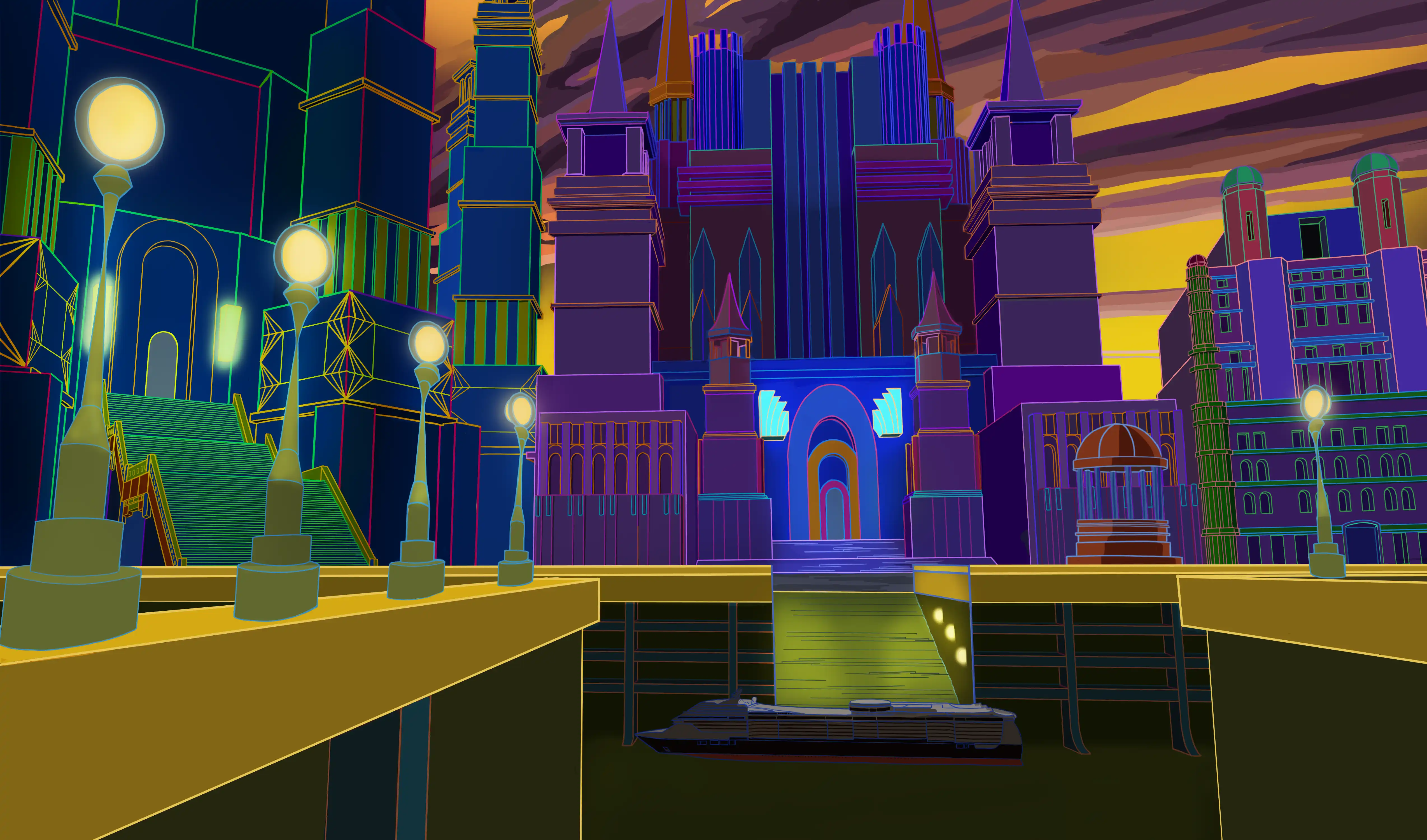
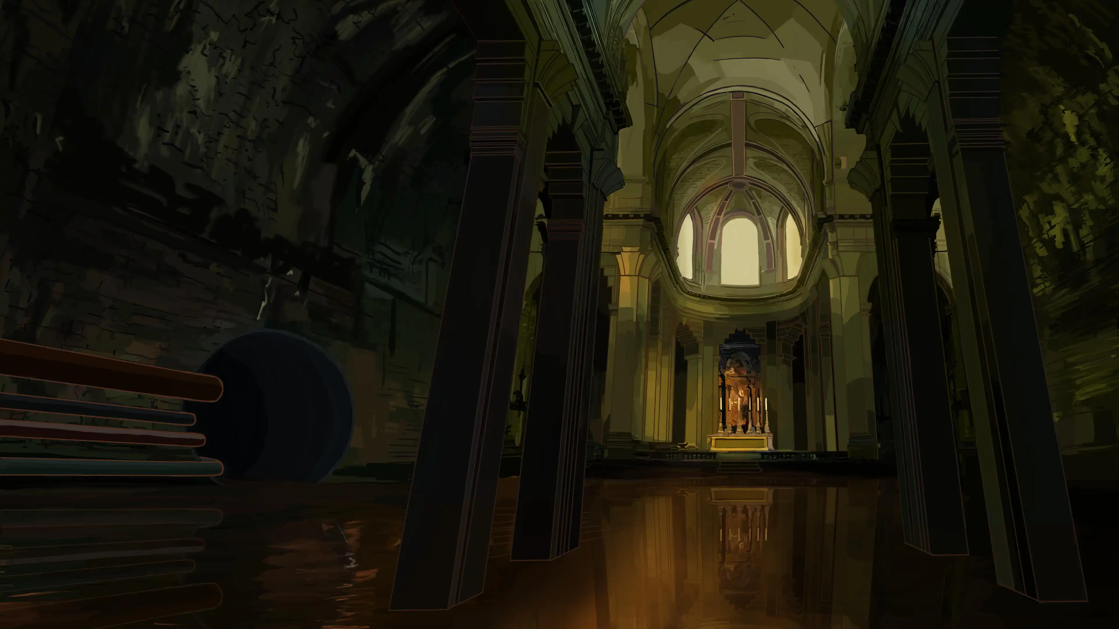
Si je travaillais la lumière sur les surfaces, je devais appliquer le même principe aux contours. Le soin apporté à la couleur m’empêchait de me contenter d’un ton sur ton. Par exemple, un cube bleu avec un contour rouge sur la partie sombre peut avoir un contour orange sur la partie lumineuse. Ce choix ne traduit pas l’ajout d’une lumière jaune, mais reflète simplement ma sensibilité.
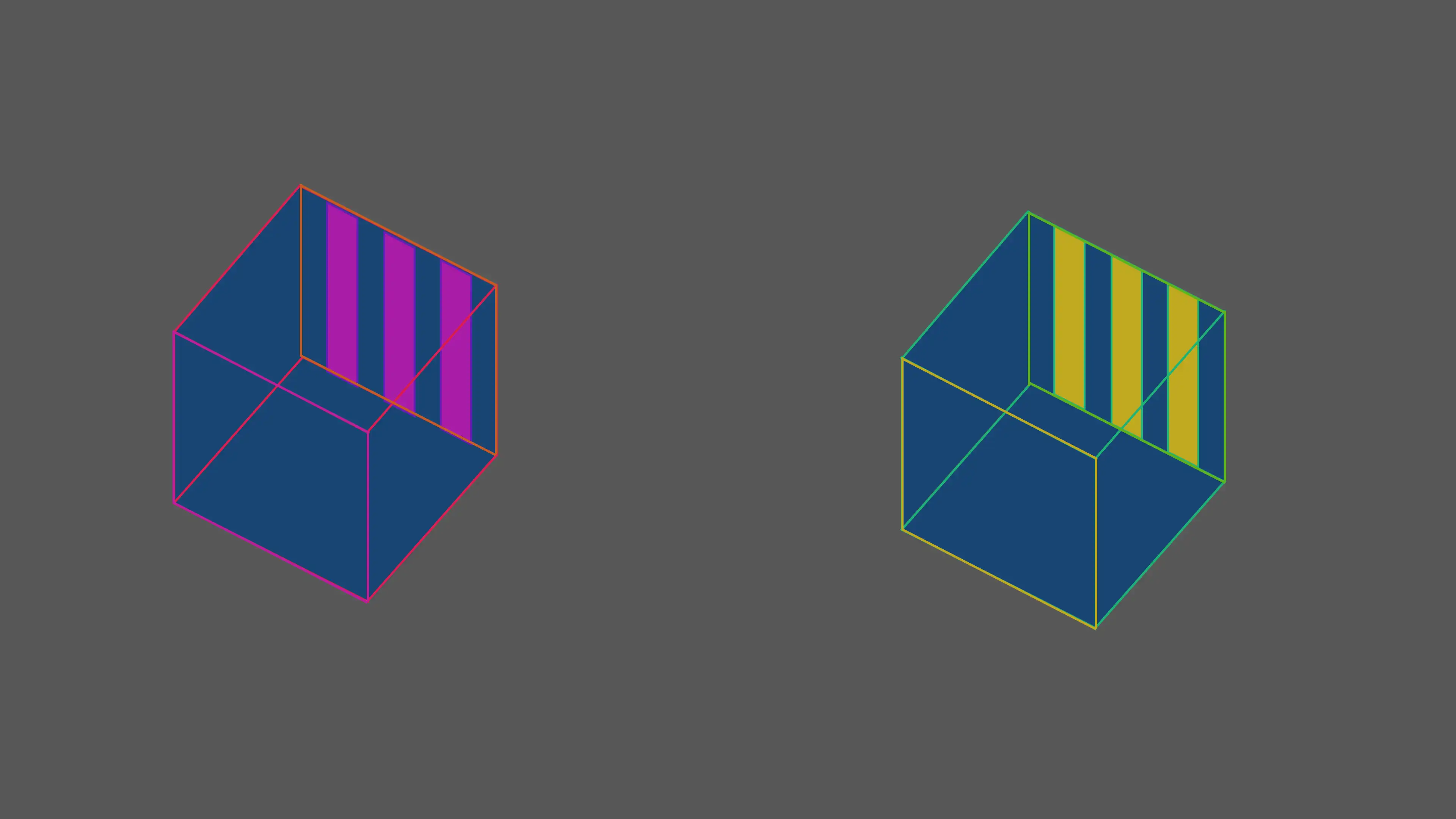
J’ai aussi constaté que le contour coloré modifie la perception des couleurs. Par exemple, deux cubes bleus : l'un entouré d’une ligne verte, et l'autre, d'une ligne rouge donne l’impression de deux bleus différents. Connaissant les travaux de Johannes Itten et Markus Rothko sur ce sujet, c’était toutefois la première fois que je l’expérimentais personnellement.
On peut le voir avec une même lumière comment une légère variation dans les couleurs peut restituer deux ambiances radicalement différentes.
Actuellement
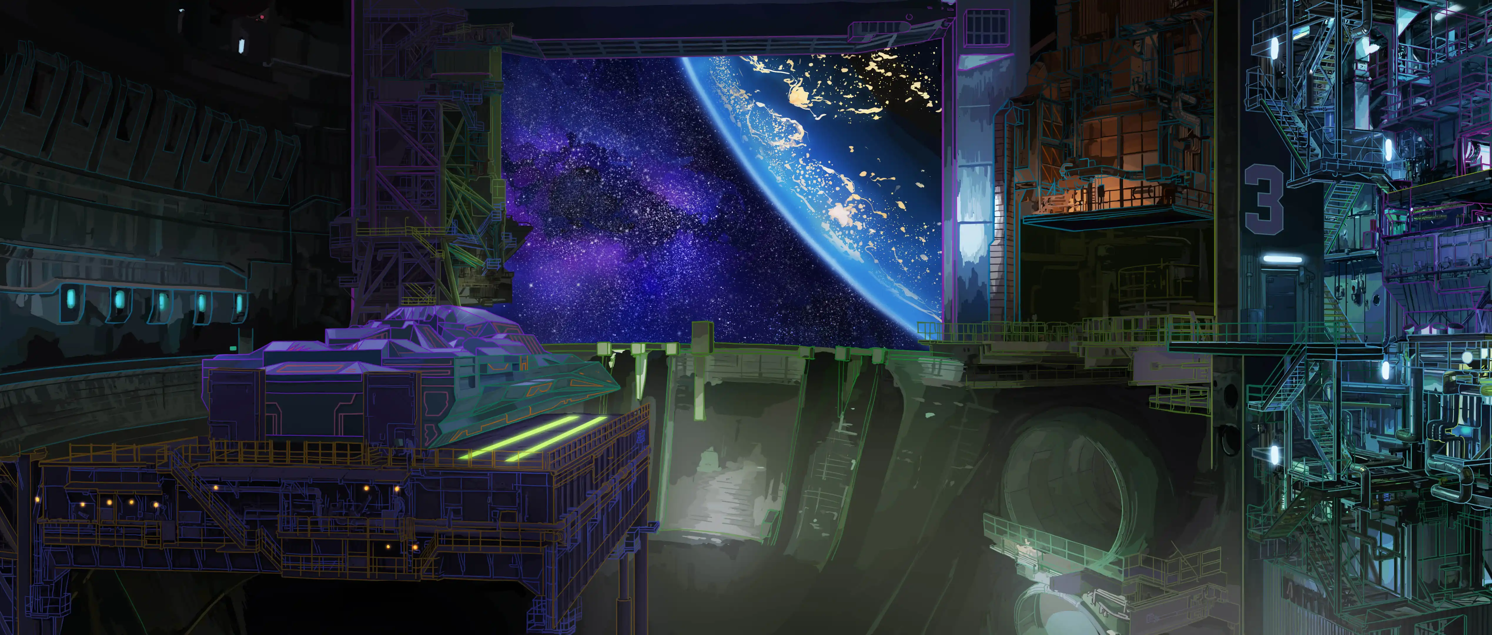
Aujourd’hui, j’envisage d’ouvrir un nouveau chapitre en me consacrant à des dessins plus conceptuels. Concernant les environnements, je pense avoir exploré la question en profondeur. J’aimerais maintenant affirmer davantage la dimension graphique de mon style. Je souhaite expérimenter des compositions plus audacieuses et poétiques, avec plus de liberté que précédemment.
Foundations - Creative Process
Introduction
Finding a coherent visual identity has been the result of a long and evolving process. I explored many directions before arriving at a style that truly reflects who I am. Through this page, I wish to share that journey — the doubts, the influences, and the choices that helped me shape a personal visual language. It is also a way of opening a new chapter, by inviting the viewer to follow this evolution.
First landmarks
I mostly drew in sketchbooks, using black markers and quick strokes. Discovering James Jean’s sketchbooks encouraged me to explore new directions — layering, transparency, and freer compositions.
Decisive stage
During the health crisis, I returned to drawing, seeking to give it true meaning and a role as a form of expression. I learned Photoshop and experimented with photobashing, yet I noticed a certain uniformity in photorealism. Despite my exchanges with professionals, no clear answers emerged. What I love is the simplicity of drawing and black outlines, which make the image easy to read. So, I created a series of drawings that break free from this photorealistic trend, embracing a freer, more authentic expression.
Process
At first, I naturally returned to the drawing style I used in my sketchbooks. I incorporated color into the process. Light is treated specifically on the focal point of the scene, while the rest is approached in a more graphic manner.
The first spark came from my rejection of the black outline, which I found too visually overwhelming. I remembered a documentary about illustrators from the Walt Disney era, who faced the same issue. They colored the lines to harmonize the characters with the background.
Moreover, in animated films, the backgrounds are more carefully crafted, with a greater focus on lighting. The characters are outlined in black and filled with flat colors. This way, the characters stand out clearly. I will take inspiration from this approach at first.
I drew inspiration from this approach to create this cover, with a notable reference to Cinderella.
I then began subtly varying the outline color, taking the atmosphere into account so that it would blend with the mood without disrupting it.
I then decided to dare saturating the line, without knowing where this experiment would lead me or if it would work. Thinking that if no one had done it before, there was probably a reason. But I really wanted to create something very graphic, different from what I usually do.
After successful trials, I continued my experiments. The colored outline proved more complex to manage: it must both define the volume of the shapes and distinguish the patterns inside, such as railings or bars. I chose to work on two separate planes, with two different color approaches.
For the outline of the volumes, I adopted a classic approach, using subtle colors that blend into the background while remaining visible. For the patterns, the rendering is more graphic, with saturated lines that stand out clearly from the volume.
If I worked on the light on the surfaces, I had to apply the same principle to the outlines. The care given to the color prevented me from settling for a tone-on-tone approach. For example, a blue cube with a red outline on the shaded side can have an orange outline on the lit side. This choice doesn’t imply adding yellow light, but simply reflects my personal sensitivity.
I also noticed that the colored outline alters the perception of colors. For instance, two blue cubes—one with a green outline and the other with a red outline— can look like two different shades of blue. Familiar with the works of Johannes Itten and Markus Rothko on this subject, it was nonetheless the first time I experimented with it personally.
With the same lighting, you can see how a slight variation in colors can create two radically different atmospheres.
Current work
Today, I am considering opening a new chapter by focusing on more conceptual drawings. Regarding environments, I believe I have explored the subject in depth. I would now like to further assert the graphic dimension of my style. I want to experiment with bolder and more poetic compositions, with greater freedom than before.